Electronic Navigational Charts (ENC) are unique in nautical charting in that the user can define what level of detail they want to see on the computer screen. There are three IHO categories of display modes the user can choose from (Base Display, Standard Display, and Other); on top of those, the user can choose depth area colors, hide or show soundings, lights, ATON labels, among other choices. These details are not the subject at hand here. We cover them in our textbook on ENC.
Here I want to review the display modes, and make a specific configuration proposal for cleaner displays in areas with shipping lanes or other Traffic Separation Schemes.
Below is a sample of the Base Display mode. This is officially described as not adequate for navigation; it is intended to represent objects that must remain in place for all other displays.
Base Display mode. Clearly not enough info for safe navigation, but could be useful for some weather work or route planning.
Below is the Standard Display mode, which is thought to cover most navigational needs, and recommended as the default display mode for echart nav programs when first opened.
Standard Display mode. Covers many needs, but still missing sometimes crucial data of soundings and contours, tide rips, and others. Standard includes all Base Display objects.
The full display of all objects is the combination of Standard and Other, which is usually just called "All" on most nav programs. A sample is below.
All objects display mode. This is typically too congested for most applications. The triangle objects with asterisks inside are Quality of Data objects, which we generally want to hide. Recall to see details in any Blog post image, click it, then right click, then view in new tab and then zoom in.
Because Standard display is missing some things we might want to see, but All display is too much data, most programs offer some way to customize the selection of objects. qtVlm, for example, does have a custom display option, discussed below, but they include another that might meet most requirements most of the time, which is called the Detailed Display, shown below.
Detailed display from qtVlm. This display is the same as All display above, but it honors a set of choices that you make in the set up page shown below.
Detailed view set-up options. The Detailed view is the intended workhorse display mode. it shows all objects but respects your choices made on this page marked in red. The Quality of data symbols are removed by shutting off the Chart information objects. This view also respects the scale minimum setting for each object as well as how you have modified it here. See our online course in electronic charting for details on these settings.
The detailed does indeed work well for most applications, but we can clean the chart up a bit more if we remain vigilant of what we are hiding. The detailed view shows all the cables and power lines crossing the waterway, which complicate the chart when we are also trying to identify, say, traffic lanes in a an are.
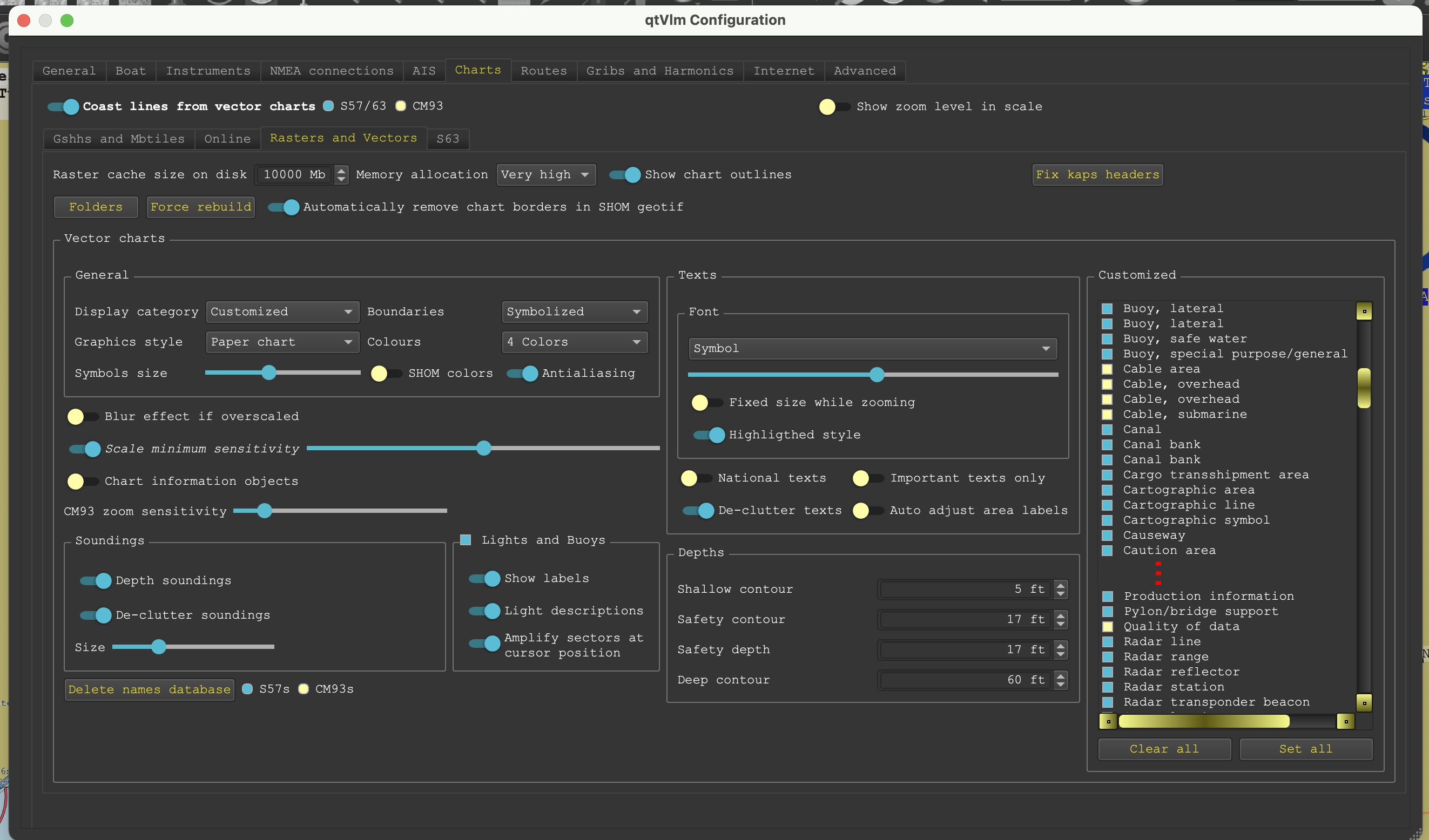
Thus we have another option of using the Custom display mode, which starts with all objects, and then we turn off the ones we do not want to see. In this case we shut off the quality of data objects and all the cable objects as shown below.
Custom set up options. Here we turn on all objects and then shut off the Cables and Quality of data objects
This creates a clean display with traffic lanes clearly standing out, which is good for an area like Puget Sound and other waters that have crucial traffic lanes crisscrossed by numerous cables. An example is shown below.
Custom display of all objects except cables. A clean view, but we want to turn the underwater cable display back on if we are going to anchor in this area. The lines left are the shipping lanes and the ferry routes, both of which become mored detailed as we zoom in the view.
That completes a long introduction to the possible value of using custom display to declutter the chart of cable crossings. Again, when anchoring we need to turn on underwater cables and pipelines.*
Here is a video on this topic more generally:
ENC Object Display Modes
_______________
* Object PIPSOL (pipelines, submarine/onland) are similar to object CBLSUB (cable, submarine) in that they both have an attribute BURDEP (buried depth) that tells us how deep the object is below ground underwater, but this is not a required attribute, so we do not often see it given.
In Oct last year a ship did drag anchor in a storm which led to damage of a pipeline that led to an oil spill off of Huntington Beach, CA. The pipeline involved is shown below.
Section of ENC number US4CA60M. The dashed lines with circles are pipelines. We see a pipeline running SW from the west most drilling platform with a pipeline and cable running north out of it. The other platform has a pipeline to shore. Presumably the ship dragged out of Anchorage Area F which has a pipeline right at its SE border. I am not sure which pipeline was damaged, but likely one to the right or left of the vessel icon shown with a blue circle.
One of the most basic principles of piloting underway is keeping track of the bearing to a prominent landmark or light as a way to set limits on your location. Perhaps the most notorious example of this is the 24 year old AB Lookout telling the 39 year old Third Mate in charge of the Exxon Valdez that the red light on Buoy 6 was on the wrong side of the bow. In fact, she told him twice. The grounding and subsequent tragic oil spill that followed affected the lives of thousands of people for more than a decade. The circumstance of the incident is illustrated below.
Figure 1. Glacial ice from Columbia Glacier had stretched across the shipping lanes, so the southbound ship was given permission to temporarily leave the lanes to go around it by the green route, which was not uncommon. But the officer in charge failed to turn in time and wandered off course as noted by the red line. The grounding occurred at 0009 AST (Alaska Standard Time). The Lookout reported the light was on the wrong bow, implying the ship was not where it was supposed to be, at 0001 AST.
Figure 2.Lookout reported the red Buoy 6 light was on the starboard bow at 0001 AST and should have been on the port side of the bow, but this observation was not acted upon.
Normally we would not rely on buoy locations for crucial navigation (because they can move), but this was a very important buoy whose position was carefully monitored, nevertheless, it has since been replaced with a light on a beacon fixed to the reef. The chart above is one for the time of the accident in 1987 that we found in the NOAA archives. Other details are from the official NTSB report.
Returning back to the task at hand... A single bearing to a target does not tell us exactly where we are, but it does tell us a line we are on that goes through that target, which is a line of position (LOP). If we sail off that line, the bearing to the target changes. We still do not know precisely where we are, but we know from the change in bearing what side of the original line we are on. This is the principle of the danger bearing.
For example, if a lighthouse bears 090 at the moment, I can draw that line on the chart. Start at the lighthouse and draw a line in the opposite direction, 270. As I proceed away from that line the bearing will get smaller or larger. We may have to look at a chart and compass rose to picture this numerically, but if the bearing gets larger, i.e., 090 goes to 095, goes to 100 etc, then I am sailing north of that line. If on the other hand, the bearings get smaller, i.e., 090 goes to 085, goes to 080 etc, then I am proceeding south of that original line, as shown in Figure 3.
How fast the bearing changes depends on how far away the target is located. This type of navigation reckoning is generally done with fairly close objects, within a mile or so, not with distant landmarks on the horizon, whose bearings barely change as we move. If an object is 1 mile off, you will get a 6º bearing shift for every 0.1 miles off the line you move.
Figure 3.How bearings to a point tell us if we are to one side or the other of a reference bearing.
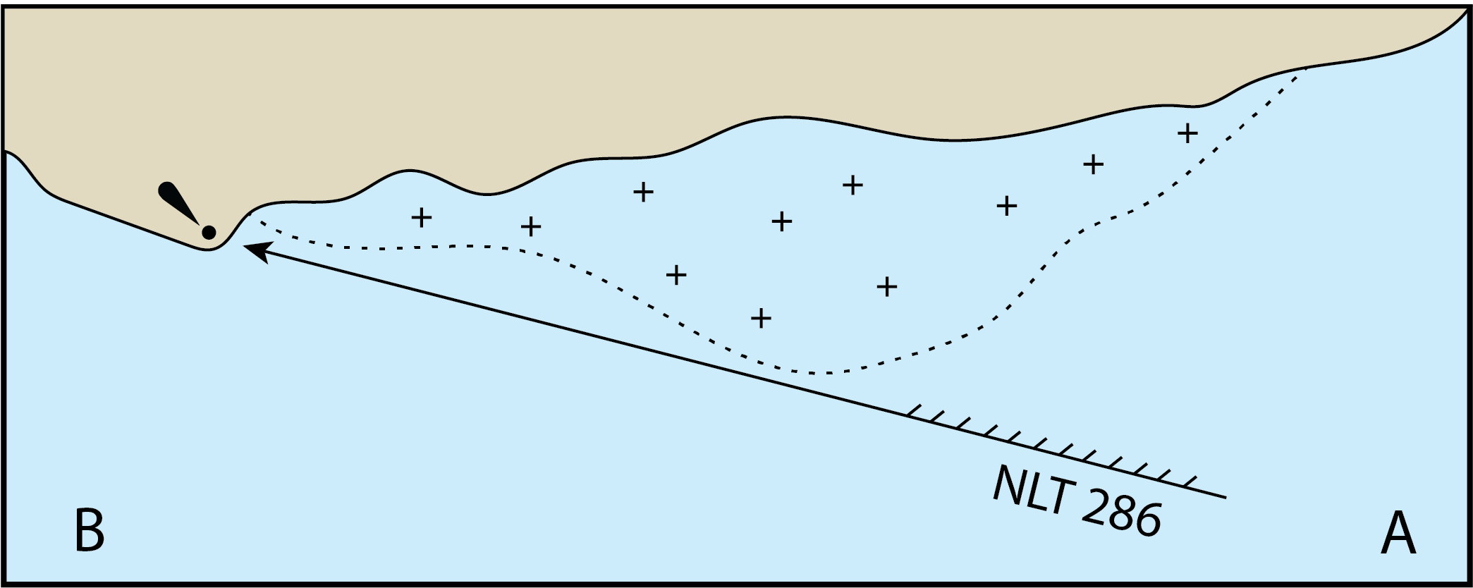
Now we can see how to apply this concept to a "danger bearing." Suppose we want to transit the area from A to B in Figure 4, and we know there is a north setting current that might push us onto the underwater rocks. We have other ways to guard against this especially if we have radar, but it always pays to use all methods possible, plus we might not have radar, nor any electronic aids, so these basic methods remain crucial.
Figure 4.A danger bearing set up to guard against getting pushed on to the rocks. We need to stay below the 074 bearing to the light which means we monitor the bearing of the light and it must stay below 074. If the bearing slips to say 076 and 077 we have been pushed across the line
Now we can take a short look at how this basic concept can be made more complex than it really is. We look at this same example as presented in Bowditch (American Practical Navigator.)
Figure 5.Danger bearing from Bowditch. NMT stands for "Not More Than." Y is a bearing that is less than 074, and Z is a bearing that is more than 074. The goal is to state that we must sail in an area where the bearing must be kept less than 074, which is stated in the negative as we want a bearing that is not more than 074.
Headed in other directions the instructions could be different, as shown below.
Figure 6. The Navy way of specifying the limits on a danger bearing in the other direction. Here everywhere on the safe side of the line, the bearing to the light is greater than 286, so the danger bearing is specified as Not Less Than 286.
Looking back briefly to the Exxon Valdez, the danger bearing concept could have been applied more digitally as shown in Figure 7.
Figure 7. Applying the danger bearing concept to the Exxon Valdez incident, we see that a guide of NMT 219 on the buoy light could have kept the ship on the safe side of the buoy and off the reef. We keep in mind as well that bearings taken with a ship's gyro repeater can be very accurate.
We have these extended notes on this topic because periodically this concept is a stumbling block in our navigation course. This can come about because of lack of experience with numerical bearings, complicated by the use of a negative phrase, i.e., "not less than" versus "more than."
Another stumble comes up when someone mistakenly assumes their location or heading affects the choice of the danger bearing. These do not enter into the decision.
To avoid these snags when working an exercise or in actual navigation practice, use these steps:
1) Identify the hazard.
2) Find a prominent landmark or light (target) from which you can draw a line that spans the region where you might be exposed to getting pushed into the hazard—think of it as a boundary line you do not want to cross.
3) Then measure the bearing along that line toward the target. That is your danger bearing.
4) Now we need to figure how to specify the bearing limits to look out for. Imagine your boat on the safe side of that line at a couple places along your intended passage, such as the first three positions in Figure 8. Then measure the bearing to the target from each of these positions. You will see the bearing getting smaller (or bigger in other cases) as you approach the danger bearing. If it is getting smaller as you approach the line, the limit is NLT (not less than) the danger bearing. If it is getting bigger as you approach the line from the safe side, them the limit is NMT (not more than) the danger bearing.
Figure 8.A danger bearing of NLT 220 T, showing a vessel entering the channel getting set across the line and quickly turning back across the line into safe water. Consider the first 3 positions as sample points to check that the bearing is getting smaller so the limit is Not Less Than.
Another way to punctuate the fact that a danger bearing does not depend on where we are or what route we follow is to think of the role of sector lights set up to warn us of dangers, as shown below. If the light is white, you are in safe water; if the light is red you are in dangerous waters—you have crossed the danger bearing line.
Figure 9.The sector light at Gay Head providing a danger bearing for the area around Nomans Land. This is a echart display (qtVlm) that shows the light coverage and range when the cursor is on the light. In an ENC display white lights are yellow. Here we have a white light indicated by the yellow tint on the chart, along with the red tint for the red sector. Both have nominal ranges of about 20 nmi. The inside yellow ring indicates that there are back up emergency white lights for these but the ranges are not known.
Sailing north at night on the west side of Nomans Land there are no lights to warn of it. In an east flowing current this could be a hazard so a red light sector has been provided to warn us of this. If that red sector were not available, which (by chance) runs due north at 000, we could use that bearing to Gay Head light as a danger bearing meaning here we want to keep it to the right of 000, which is on the small numbers side or north, and not slide into waters where the bearings are to the left of 360 on the large numbers side. As in a lot of navigation scenarios, we may have to improvise... in this case we must improvise how to remember the bearings when a danger bearing is right at or near 000. The simple NLT or NMT does not work well here!
_________
Added Apr 27, 2022.
In response to an interesting question from Andrew in the comments: the answer is yes, there is still warnings in the Coast Pilot about ice over the full region at times, but almost certainly it must be less, which brings up your second question. How much has Columbia Glacier receded in this period, ie 1987 to 2022. See the new chart below to show that the Glacier has moved back well over 7 nmi.
This picture is made using item (6) from starpath.com/getcharts.
you see a list of files and each file has a number, sequentially from 1 to about 2,041, which must represent about how many US ENC there are at the moment. Note that these are file numbers not chart numbers, which are listed beside this file number.
Inserted at several places in that list you will see file numbers listed as "cxl" as shown below.
We have learned that these charts with file number cxl are ones that have been replaced by reschemed charts, but for continuity they are left on this list for a period of time. They will eventually be removed as they are now outdated.
The header text inside these charts indicate this status, and some electronic chart systems (ECS) read that and then refuse to open these charts, as they are indeed now outdated. qtVlm, for example, posts an alert that you tried to open a chart that has been canceled by an update. Other ECS will open these charts without warning they are outdated.
To learn which reschemed charts cover the region you are trying to access with one of these older charts, use this link to go to that area to see the new charts available.
The reschemed ENC are very fine products with notable improvements over the existing versions; we look forward to more of them. Progress in the program can be seen here
Traditional paper charts are in the process of being replaced with electronic navigational charts (ENC) and a new form of paper chart called NOAA Custom Chart (NCC), based on these ENC. In this new system, the user designs and creates a high-res PDF file of the paper chart they want using the NOAA NCC online app, and then it is up to the user to get these printed. Existing print-on-demand (POD) outlets will likely play a major role in that process, especially for commercial and government applications, but there are also other options that might meet the needs of many mariners. There is a video at the end of this post on the process of creating an NCC PDF.
We keep in mind here that the desire for having the paper charts is for many just a secure backup to the primary navigation done with the electronic charts, and the backups can be in other sizes and papers than are used in the traditional paper charts. The present POD traditional charts are all of standard, fixed sizes and all on high-quality heavy paper. A major virtue of the NCC is we can choose the area we want to chart, it does not have to match existing charts, and it is up to us to choose the size and quality of the paper.
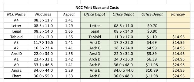
There are several nuances to creating the NCC, such as scale and depth contour choices and the location of compass roses that we cover in a separate NCC design video and is not the topic at hand, which is the printing. Below is a summary of the products we can create and print.
It takes some thought and practice to get the paper size and chart scale to best meet our needs, which is discussed in the video, but we will want to keep in mind how we are going to print the chart as we make those decisions. A couple things to note in table above.
First, "Paracay" stands for Paradise Cay Publications, who are an official POD chart distributer in California who have agreed to print NCC for users even now, as mariners are just learning this new system. They use high quality paper and have efficient shipping methods in place. Charts printed there will have the correct scale and be on paper we are accustomed to in traditional nautical charts. There is a fiducial marker strip on the bottom right of each NCC that can be used to confirm the printing scale. Likewise on the bottom left there is the intended dimensions of the final product.
Since this was first published, we have two more POD printers who have joined in, and indeed took the lead in that they have instructions on their websites on how to do this. Later we will expand the above table. It is worth looking over the print sizes, papers, and costs from each. See
Needless to say, all remain excellent sources for traditional paper charts, which will be available for many charts for the next year or maybe two. EVG also has an extended source of international paper charts as well as ENC and RNC.
The process of ending the traditional charts is an ongoing one. It is not that they will be discontinued on the magic date of Dec 31, 2024; rather they will all be gone by that date, some of which are already gone. Many will be gone by Oct 5, 2022. The phrase they use is Sunsetted."
Next, "Office Depot" is here used to represent several commercial printers across the US. Office Depot (who acquired Office Max) has by far the largest number of outlets, but Staples has similar options, as do several smaller chains or individual outlets. Some FedEx Office outlets can also print these, but their prices are notably higher. I emphasize Office Depot because we have actually made several test prints with them with good success.
It is clear from the table that there are less expensive options to traditional chart printing that might meet some needs. What stands out is the tabloid size of 11x17 for about $1. With this new system, not only can you define the area you want, but you can also create a series of charts all the same size, to make your own chart folio set, which in turn could be coil bound. These new charts can also be laminated, or indeed printed on exotic papers such as waterproof or even Tyvek.... these would be from another source and we are in the process of confirming that they will take part in this program.
To print NCC in the letter, legal, or tabloid size, a good approach that you can try right now from any place in the US is just login to www.printme.com and upload your NCC PDFs, enter your zip code to find the nearest printer, and get the code for the job, which you can then tell the printer. They also give driving instructions to get there!
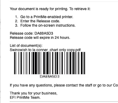
You will get back in the email a notice like this
which includes the code you need. Then at the Office Depot, you can use the self service printers by just entering this code. This expands the access to get a print (tabloid or smaller) because the Print Department in the stores have shorter or sometimes irregular hours compared to the full store.
You can still use the self serve printing without the prior file delivery to printme.com because you are given the option to email it to them from there... or use your thumb drive copy.
Beyond the tabloid size, the trick to printing at Office Depot is these NCC charts can be printed in the Blueprint category, which is much less expensive than their poster category. To print these larger charts, or in fact any size, copy them to a thumb drive and take that to the local Office Depot. Larger than tabloid cannot be transmitted with printme.com. Tabloid size paper (11x17) is sometimes called "ledger."
Another option is just email the chart files to yourself as attachments and open the mail in your phone to get the files into your phone—or move to your phone by air drop or other means—and use your phone to take them to the printer. At that point, you can mail them to the print desk as you stand there. Or check with the printer. Each store has a unique email you can use once you make arrangements with the print desk. In the long run, a thumb drive (available at Office Depot!) is likely more efficient than using your phone as a thumb drive.
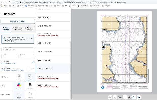
You can also do it all online, once you find your way to the Blueprint section. A sample of the interface is below:
Once done you can then buy it and either pick up at the store or have them ship it. If you have the charts shipped, it could pay to check Staples options. The printing is about the same price, but the shipping is much less—checking today, Office Depot shipping is ~$10 and Staples ~$5, with the latter offering a 2-hr courier delivery at $15 (we are in Seattle, about 10 mile from this printer).
Some home printers can print 11x17, but it might still be hard to beat the $1 price of having it printed for you. They are using 28# paper for these, which is heavier than most of us have in house, and their colors are calibrated, and they don't run out of magenta!
The 22x34 is also a very nice size for a sailor's chart table. Remember that we almost always have to fold a traditional chart to use it on the chart table in the nav station, so now we have the option to print that same chart as two charts each the size of our chart table... or maybe we only need a limited section of this chart, so we select it out for the NCC design.
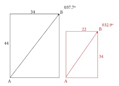
When printing these charts you have the choice with the printer to keep the original size (aspect or shape) or fit to the paper size. We want to always choose to keep the original size, and print on larger paper if needed, then just trim off the blank margins. The 11x17, 22x34, and 34x44 have exact matches on the commercial printers. But if we want, say, the A0 size of 33.1x46.8 we would choose Arch E at 36x48 and just trim it. Below shows the distortion in bearings by printing one one aspect ratio and printing on another.
Letting the printer fit to paper can distort the mercator projection so bearings measured from it will be incorrect. This would not be an issue if the aspect ratio of what you created, say 1.55 of 22x34, matched the one you chose to printed on, say, 11x17, or vice versa. This should not affect the bearings or distance measurements, but technically, one would have the wrong scale by a factor of two.
Here we produce a chart on 22x34 (aspect 1.55) and decide we want to print it larger at 34x44 (aspect 1.29) or vice versa. It is the same chart on two different paper sizes, comparing the bearing from a point in one corner to the other, we see we get a bearing error when not on the right paper. This can be computed as bearing = atan(34/44) = 37.7º or atan(22/34) = 32.9º. In short, we want to print on the size stated on the bottom left, or one that has the same aspect, ratio of length to width.
(Note this is not a precise description because the print size refers to the paper size, not the chart size, and the margins are not the same width top and bottom, but the bearing discrepancies are about of this magnitude for this aspect difference.)
For the higher quality paper using a professional chart printer like Paracay, the price depends only on the shortest dimension of the chart. For 22 inches or less on the shorter side the cost is 14.95, and for larger than 22 on the short side, the cost is $24.95, up to 42 inches wide on the short side, regardless of the long dimension of the chart in both cases. They also have very good shipping fees: Media Mail is $3.50 for any
number of charts or $10.50 for Priority Mail.
___________
A Note on Compass Roses
The NCC program has several known issues they are working on. One is the presentation of compass roses. They have an option to include or not include compass roses, but if the area you have chosen to chart does not include a compass rose on the native RNC, then none shows up on the final product, and the variation is not printed on the chart.
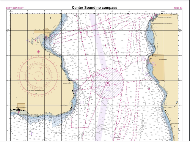
If the chart has one or two compass roses, you can choose to add them, which may work out just fine. In some cases, like this Center Sound example, adding the roses adds too much clutter.
When compass roses are present and you choose to not shown them, we get these small magvar symbols with the variation noted beside it. It is there then, but not a very satisfying solution.
For those who want to do a bit of extra work, we can capture the compass rose from the set up page and then paste it into the PDF. This operation can be carried out in Mac using the Preview app. In a PC, you can add images to a PDF with the free Inkscape app.
Below is a sample of manually pasting a compass rose into the chart above.
We a free online app that will make these compass roses for you based on a known variation with a transparent background that you can then paste onto the chart where you want it. See link at starpath.com/NCC. This can then be used as we learn how this issue will be resolved by NOAA.
____________
Evaluating a couple samples
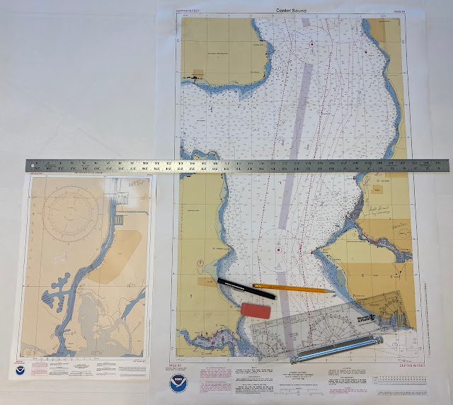
Bellow we see two we printed at Office Depot. One at 11x17 (at 1:5,000) and another at 22x34 (at 1:25,000). You can click the image, right-click it, open in new tab, and then zoom for details.
The printing and colors are excellent, but it is still important to make such tests to see what meets your needs. For strictly back up, these should be fine, but even at 28#, the paper is not nearly as durable as the chart paper you can get at POD outlets, such as Paradise Cay. We did a study of chart paper when wet (What Happens When Nautical Charts Get Wet?), and Paradise Cay paper did a superior job. You can even smash them up into a wet mess then dry them out and iron them. These stock Office Depot charts will not handle water, essentially at all. Both ink and paper fail fairly easily. There are lamination options to consider, which might work depending on application. It is about $4 to laminate one... or put on special coatings.
We also did a video on Erasing Property of Print on Demand Charts, and the better papers did well on that, but these simple paper charts do not erase as well. Doable, if we use lighter lines, but not as good as the traditional POD charts.
In short, the quick print outlets at lower price may well meet the needs of many mariners, but traditional POD outlets will be likely be our primary source for paper charts intended for routine use.
As you practice with these now, remember the program is still in the development stage. NOAA is working on several ways to improve the products. In the above chart on the right, for example, we see that the density of soundings obscures at least one important light, so it would be nice to have an option to turn soundings off or at least de-clutter them like most echart programs can do when viewing the ENC—or in this particular case, these soundings have a SCAMIN of 11,999, which means they should not show at all for scales smaller than that. We are looking at 1:25,000 so they should not be there in the first place... at least in ENC terms. The program does have a nice way to label the depth contours, which might be enough for many applications.
.jpg)