Friday, December 27, 2013

Google Earth as an Aid to Chart Reading

We have an exercise in our online course on navigation that asks students to choose useful bearing targets when heading east along the south side of the Strait of Juan de Fuca, just passing Freshwater Bay. We have students from all over the world, and most do not know the area. This is not a problem, because we are focusing on chart reading, and that is the same worldwide. Skills you learn from one chart are usually easily transferred to other charts, in other parts of the world.

With that said, there are nuances to chart reading, and sometimes the terrain may be more complex than might appear from a chart. Also some cryptic notes on the chart or in Coast Pilot may not be clear till seen in person.

Thus enters Google Earth, which does indeed let us see coast lines around the world. Here is the example at hand. Below is the chart of Freshwater Bay, and in the background we see two mounts clearly marked. These were part of an answer to our practice question, so we add this new dimension to that answer.


Now turn to Google Earth and find this location (you can type in a lat lon, as one way), and you will get after some zooming, rotating, panning, etc the following view of the bay... looking south from over the water.


The round spit on the left is Angeles Point, which by the way is where the USCG defines the limit of mariner's sea time between coastal and inland. Every mile you log west of there is coastal time; east of there it is inland time.  It is a bit arbitrary.

We can now use Google Earth to look up from here, from a lower perspective. This one is more from a plane than a boat.


Now we begin to see more or less what you would from the water, but it still might be difficult to find the two mounds we are looking for.  So me must get out the binoculars, which we do on Google Earth by holding the shift key and moving the mouse up the screen.


This works very well, but not quite as good as we might hope for.  The two peaks that are charted are there because they are indeed more prominent than shows here.  The graphics cannot quite match the actual shading that is seen in life.  The background behind these would be notably darker so the peaks stood out.

Below is the areal view with push pins set at the lat lon of the two mounds, that shows a bit better why these show up more distinct from the water.


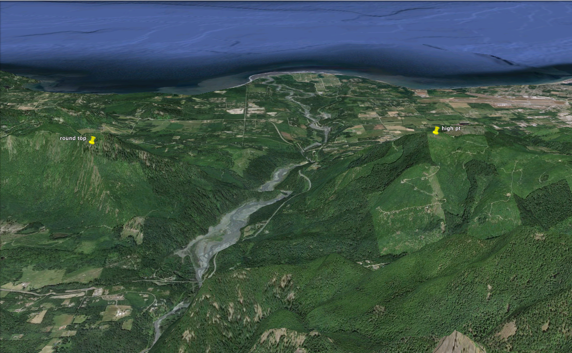
To have more fun with GE, you can also travel inland and look back out the river valley that these mark, as shown below, looking north.


If you have not played with GE in this manner, you might give it a try. It takes a bit of tweaking and practice. You might want to go to Settings (Preferences) and choose the option to exaggerate the vertical scale, and of course have 3D turned on.  I find it works best using a mouse than a touch pad.


Saturday, December 21, 2013

Model Predictions of World Winds

This shows numerical wind predictions from the same programs used by the NWS. You can zoom, click and drag, or click on a point to get Lat-Lon, speed, and direction. You can also click on the word Earth, to get other options, ie look at the winds aloft (500 mb), or change to a Mercator projection etc. Really nice work from Cameron Beccario. The original source is earth.nullschool.net
This concept and an implementation of it has been around for many years. It was originally an art project and was more stylized than realistic, but now it is a working tool that much helps us understand the winds of the world.


Tuesday, December 17, 2013

Starpath Ship Reports Revised

We offer a free email service for mariners with which you can receive by email all the official ship reports of weather and sea state for the past 6 hours from within 300 nmi of your location on any ocean.  This service is described at


It is a powerful service, in that it is essentially a live look at the wind and waves around you, in any ocean at any time of day or night. You could also use it to check your barometer if you forgot to calibrate it before you left. Many vessels these day have email via sat phone or HF/SSB radio.

We have offered this service for almost a year now, but we just noticed that the way enhanced spam filters are now working, along with the increased use of html mail, that we were getting as many rejects as we were valid requests... not counting of course the tons of span that hit the server continuously.

To improve the functionality of this service we have restructured it so that you now use the subject line to send in your latitude and longitude, rather than the way we used to have it when we pulled your location from the body of the message.  Now the body of the text can be anything, in any format and it will not matter.

If you have not tried this, give it a go.  If you live on a coast, it is even a way to get "buoy reports" from offshore waters where no buoys exist.

Or if you are following a friend's voyage across the ocean, you can with an email learn in a minute or two what the actual conditions are where they are.

We have a similar free service for asact wind data at starpath.com/ascat.


Monday, December 16, 2013

Local Pressure as a Squall Goes By

We might guess that when a big squall goes by we could detect a drop in pressure if we had an accurate and sensitive barometer on board.  These are local lows, after all–but this measurement might be tricky, and depend on more than we guess.

For example, in our office where we do have numerous instruments like that, we see pressure drops when the wind gusts outside of our leaky front door.  You can test this as well with a good instrument in a car.  Drive along with the windows closed at 30 mph or so, and watch your barometer display carefully.  Then open the window a crack.  You will see a sudden drop.  With a nice recording instrument you can study this in depth.

Thus with the low pressure of the squall, and the venturi effect of sucking out the air from the boat (or house or car) we can expect to see a nice drop when a big squall goes by.

Well... let us think again on this.

Today we have a very specific measurement of such an event. Measured by a sailor underway off the coast of Panama using a precision electronic barograph. The results are shown below.


 I will come back to the normal daily oscillation in tropical pressures, but note the pressure as the squall went through. These folks had been sailing in these waters for several years now, and they described this as the worst squall they have seen. They estimated the winds at 40 kts and it lasted nearly 30 minutes.

And sure enough, the pressure did not go down at all. It went up!  And it stayed up quite a while during the strong wind period.

At this point we can only guess that the wind blowing against the boat pressurized the cabin.  As opposed to opening a car window when moving, if you instead sit in the car watching a good barometer when someone closes the door with all windows closed, you will see something like this, but on a shorter time frame, and more dramatic rise.

We will have to think on this some more, but it was a neat surprise, and it brings to light the great values of an accurate and precise barometer.  In this case the bump could be seen nicely on the 3-hr instrument display and better still in 3-min steps, which are plotted above.

In the tropics the pressure oscillates during the day due to a tidal behavior of the atmosphere. We discuss this in depth in Modern Marine Weather. The picture below is from that book. It shows a clock dial we developed to help remind us of this behavior, and an annotated capture of data from the NDBC, at which you can see this behavior by just clicking some reporting station in the tropics.

The times listed on our clock are solar times, referring to 1200 as local apparent noon. If the peak height of the sun at your location with your clock zone is say 1335, then you would adjust these times by 1h 35m.


Friday, December 6, 2013

Worldwide Shipping Lanes

The following can can be used to update pilot charts with density of worldwide shipping lanes.


Adapted from the original work of Benjamin Halpern et al, ScienceVol. 319. There is a more detailed image available at the UCSB National Center for Ecological Analysis and Synthesis but it is really huge, and we have not figured out how to handle it yet.