A polar diagram is a graphic presentation of a sailboat's sailing performance in various wind conditions. The same information is also often presented in the form of a table or spreadsheet, which is how the data are originally collected or computed, which in turn is then plotted on a polar diagram as shown below. Programs that compute this data are called velocity prediction programs (VPP).

Below are the same data in table format. Here we learn that this Farr40 sailing in a true wind speed (TWS) of 20 kts at a true wind angle (TWA) of 135º should in principle have a boat speed of 11.85 kts. We can read this from the diagram, but get more precise readings from the table. As discussed below, these are theoretical or target speeds based on yacht design. It is up to the navigator to determine if these are realistic values or do they need to be modified to match actual performance.


A convenient combination of this information can be presented in a navigation program that does a digital interpolation of the table and diagram simultaneously, as shown below in this example from qtVlm, another large source of polar diagrams.
In this qtVlm display, we set the true wind speed (to any value, does not need to be in the original table data), and then putting the cursor on the diagram creates the blue line which can be moved to the desired TWA as the corresponding boat speed and other data are shown on the right. This app also has a table view, but it is mainly intended for editing the polar, since it can double interpolate as shown here (i.e., any TWS or TWA) to get specific values.
We see here also extra output that is common to polar diagram presentation, namely the prediction of the best performance directly upwind and directly downwind, as illustrate below.
This display shows what your best TWA is when your destination is directly upwind or directly downwind. For this Farr40, in 10 kts of TWS, the best upwind TWA is 41º at which time your boat speed should read 6.9 kts, and your actual progress up wind, called velocity made good (VMG) would be 5.24 kts. You would tack back and forth till you reached the layline to the mark.
The same is almost true when sailing downwind, but there is a difference. Sailing upwind, by definition you would always be sailing the optimum upwind TWA for that TWS. Unless there are environmental or tactical reasons to do otherwise, that is the way you best progress upwind—and any target that is not on the layline is by definition upwind. In other words, you would always choose to sail upwind at the TWA that is right where the red curve meets the green curve on this polar diagram presentation, because that is best speed upwind. In the real world, one tack might be faster than the other, which affects this decision, but we are not considering such perturbations for now.
Sailing downwind, if the target is indeed dead downwind, then you would again sail the TWA recommended where the red meets the green, jibing back and forth across that line. For example, if the true wind direction (TWD) were 070, blowing toward 250, and the rhumb line course to your target was 250, then that is what you would do for best performance—again assuming speeds were equal on both jibes and you did not have other reasons to favor one jibe over the other.
With this Farr40 in 10 kts of true wind this means we would want to sail at TWA = 150, which we achieve at a heading of 220 (30º to the left of the direction the wind blows toward) where we expect a knotmeter speed = 7.6, and a projected speed downwind of VMG = 6.6, which we assume will be the same on both jibes.
In practice, however, the target is not likely to be dead downwind, so the job is not to maximize the speed downwind (VMG), but to maximize the speed in the direction of the desired course, called velocity made course (VMC). It is the projection of the speed you are sailing onto the direction of the desired course, as shown below.
Speed over ground (SOG) and course over ground (COG) are direct outputs from the GPS. The course to next mark (CNM) is computed from the boat's present position and the Lat-Lon of the destination.
We can go over a couple numerical examples of finding VMC from the polar diagram, but in practice this VMC is usually found by experimentation under sail, because all instrument systems can display the VMC being accomplished, as determined by the SOG and COG from the GPS and the known heading to your desired course, CNM. It is a simple, accurate computation that does not depend on anything difficult to measure.
Following up on the example above, let's say the desired course was not dead downwind at 250T, but instead it was at 220T, which is 30º to the left of dead downwind. Our first reaction looking at the polar data shown above might be "Lucky us; our destination is right on the heading that gives maximum speed downwind." But things are not quite that simple; on closer look, that is not the optimum heading for our destination. We have several ways to figure that out directly from the polar plot, independent of what nav program we use.
Recalling that the polar is aways oriented in the direction of the wind, we can think of looking across it in the direction we want to go, as shown above. The best TWA downwind was 150, meaning with wind at 070 we steer a heading of 220, which yields a best VMC = 6.6 kts, but if our destination is actually at the course of 220 (not 250 which is dead downwind) the best TWA = 135, which we achieve at a heading of 205, yielding a best VMC of just over 8 kts. Again, we do not often need to solve this ahead of time because we can find it experimentally as shown below, but it can help to understand the concept. We can get more precise values from a spreadsheet as shown below, where the "polar speeds" shown were interpolated from the qtVlm function mentioned above.
Most nav apps offer more direct ways to determine the optimum VMC. qtVlm, for example, lets us draw the polar right on the screen that matches the existing wind forecast, or we can mock up a case with its Force-wind option (Grib config/Corrections/Force wind) set for this example to 10 kts from 070. Then we can draw various lines to look at options, as shown below.
This presentation of the on-screen "speed polar" shows both sides, where as typical presentation is just one side. Some nav apps have a way to think through this and display the optimum VMC without special setup (see qtVlm's pink arrow below), but in all cases we still have to go to the approximate heading we think is right and then try 10 or 15º either side to see what maximizes the VMC. Note that the max values cover a fairly broad range of TWA and the sea state will always have an effect on this. Below is an illustration of this using the qtVlm simulator.
Beside watching a plot of VMC vs time, qtVlm shows two arrows on the microboard at all times, one showing heading to the course and the other (pink one) is optimum VMC taking into account wind, waves, and currents. Below is a short video (5:43) showing where the above data came from.
When sailing an ocean route downwind, one of the ongoing concerns is "Are we on the right jibe?" Keeping track of the optimum VMC is one step to answering that, but as the wind changes and the boat speed changes, we also have to think through what this value would be on the other jibe, and these basics might help with that if you do not have digital tools that display the opposite jibe VMC at all times.
Polar Formats
Polar diagram files require special formats. OpenCPN has an extended discussion of the formats. Luckgrib accepts almost any style at all; qtVlm requires the CSV format to use semicolons, not comma separators. Expedition has their own POL format
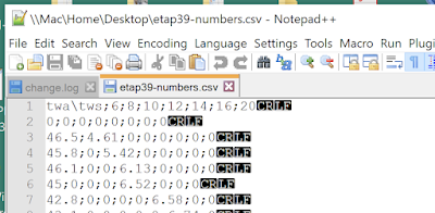
The text files for most polars require a CRLF (carriage return, line feed). Exporting an PC excel file with MS DOS txt format adds the proper CRLF at the end of each row, but Mac Excel seems to put just a CR. If you get an error message from a program such as "polar does not have sufficient data" it could be do to missing LF. You can check this in a PC by loading the file into Notepad++ and then View/Show Symbols/All Characters, as shown below.

In a Mac you can use terminal command "cat -e" to check this.
macdavid@iMac Downloads % cat -e etap39.csvtwa\tws,6,8,10,12,14,16,20^M$0,0,0,0,0,0,0,0^M$46.5,4.61,0,0,0,0,0,0^M$45.8,0,5.42,0,0,0,0,0^M$
The ^M$ is the correct CRLF symbol: ^M is the CR and $ is the LF
Sources of Polars
The programs Expedition, LuckGrib, qtVlm, and others each have an extensive set of polars included. The set within Expedition has been popular amongst racing sailors for many years, but many of these are also found at other sites.
ORC Sailboat Data has a lot and lets you see them graphically, and compare for same boat.
Polar server from qtVlm has a lot of options.
iPolar is a $10 iOS app that creates a very basic starting polar based on boat specs. You can get the needed boat specs for most boats from sailboatdata.com
Get samples for specific yachts using this link to find a country ID.
Nuances to keep in mind
The goal is always to build your polar with actual measurements, but we often have to start out with some stock polar, and the closest one we find might not have data at the low and high ends of the TWA and it might not have data for higher or lower TWS. Below is an example we found that illustrates this.

We have fairly good TWS coverage, but not good TWA going only from 52 to 150. This polar is shown below loaded into two different navigation programs that do optimum sailboat routing.

The actual data in the polar are those between the yellow and orange lines, but each program has filled in the missing data using some VPP approximation, heuristic, or simple rule.
The one on the right has a simple rule. For low wind angles, it is a linear interpolation from last data point in the polar to 0 kts at head to wind (TWA=0). It does not look linear, but that is all due to the polar plot. On the downwind end, this program assumes the boat speed remains the same at all TWA aft of the last known value, TWA= 150 in this case. As such, during a routing computation, it will favor dead downwind for optimum VMG, which is not likely right at lower TWS. Note too that this accounts for the apparent kink in the curves. That is not real; it just reflects the intersection of a fixed circle and a curve.
The computed polar on the left uses a heuristic approach, making stronger fall offs in boat speed for lower TWS. At medium and lower TWS either one of these two polar approaches might be closest to the truth, depending on the boat and sails.
The point being made, however, is both polars include some region of not real data, so after a route is run it would pay to check how much time is spent in no man's land of the polar. One way to protect yourself from getting routed off to the real no man's land, is to limit the TWA angles in the routing to say, for this boat, no closer than 50 upwind and no farther than say 165 downwind.
But the main job in a case like this is be sure to start collecting real logbook data that directly lets you improve your polar data and especially fill in the missing angle ranges. For a given TWS it would not take long to learn both ends and then just add them to the polar. We want in the logbook columns for TWA, TWS, boat speed (STW), plus sails set and maybe notes on sea state. Your wind instruments might give you this directly, and if not then you need heading (CTW), STW, AWA, AWS, and from these you compute TWS and TWA. In either case all instruments must be well calibrated: AWS, AWD, and heading sensor, and if heeled you need to know the heel angle. See Modern Marine Weather.
One easy way to fill in the gaps is to use an app like iPolar to get a rough prediction of the curves then scale them to what you think are the right data from your starting polar, and then you will be using some combination of VPP and heuristic to get starting values for the missing data.
There are also sophisticated tools such as Polar Manager that let you then load both the stock polar and the iPolar approximation and then manually average them to some common factor... which then awaits your confirmation with real data.
I hope to have data shortly to make a demo of creating a working polar for a cruising sailboat, starting from a rough base computed in iPolar.


