Saturday, January 16, 2021

Best App for Weather Forecasts Anywhere in the US

Usually at Starpath we concentrate on marine weather, being the weather on ocean, coastal, and inland waters, but this is a note about weather on land, anywhere in the US. 

The National Weather Service (NWS) is the primary source, and there are indeed free mobile apps to access NWS products. But there are ways for us to get more specific and more timely information than available in standard NWS products, and some of this information we cannot get from the NWS, although the NWS themselves use this same data when making their forecasts. 

I refer to the numerical forecasts of the National Blend of Models program, and especially their continental US version, called NBM CONUS. This model gives  a forecast every 1.35 nmi (2.5 km) across the US and large parts of Canada and Mexico. 


Figure 1. Coverage of the NBM CONUS forecasts.

The forecasts are for every hour, out to 18 hr, then every three hours for 2 days. It extends farther out in time, but that is not pertinent, because the main value of these forecasts are their immediacy. The model forecasts are updated every hour, so the primary value here is for shorter term forecasts of say a day or so, then we just update this same forecast as often as we like.

The reason I title this "best app" and not just "best model" is the app I refer to (LuckGrib for iOS) is the only app I know that  can access and display what I believe is the best data set for land based weather.  It is also well suited to be set up for your area of interest, after which you can just turn it on and refresh for latest forecast, with all parameters laid out in a nice meteogram format.


Figure 2. Two iPhone views of LuckGrib, showing NBM 18-hr forecast for central Rhode Island. Left is showing wind only for the time at the blue line. Other parameters can be selected with the second icon down on the top left. Numerical values shown are for the location of the cross hair. Right is a plot of wind, rain, and temperature over the time period of the forecast.  This type of plot is called a "meteogram." Turn on the meteogram by clicking the wind data in the map view. There is a thin blue line around it meaning it is a link.

The meteogram display is a very convenient way to look at the forecast. This can be for just 18 hours, or ask for 3 or more days. The screen can also be captured in your phone or tablet to refer back to once you learn what really occurred with the wind, rain, temperature, and so on.

The LuckGrib app (LG) includes many sources of data, meaning many different numerical models. It is my belief that this source (NBM CONUS) is the best for inland weather, but I will leave that argument for another article; everyone can establish their own conclusions with experience. Screen capture the forecast then compare with what subsequently happens. 

Besides the fact that the NBM encompasses all data and numerical models that are available (it is a blend, not a single model), and that it is updated every hour,  a key attraction is it also presents the statistical dependability of the forecasts in the form of a standard deviation (SD) parameter.  This was not shown in Figure 2 (to simplify that first look at a meteogram), but we can select it in the list of parameters when setting up the forecast. For daily use of this app and forecast it would seem logical to include this important information.

Figure 3. Landscape view of the temperature forecast (solid line) along with the SD (dashed line)  at two different times.

From this we can say that the forecasted temperature at 2 hr into the forecast is 37º ± 1.1º and at 17 hr into the forecast the temp is 48º ± 1.7º.  In other words, we can think of the SD as an error bar or uncertainty in that simple manner, but the information in the SD is actually much more specific. The diagram below shows how the SD is used to characterize a statistical distribution of results.

Figure 4. Standard deviation illustrated. From our textbook Modern Marine Weather.

In the case of model forecasts, we are not dealing with "measurements" as referred to in the caption above, but rather different computations of the forecast. The NBM includes many models, each with its own forecast, along with several groups of forecasts called ensembles. A wind, rain, or temperature forecast at any specific time and place will be the average of many, maybe a hundred, different forecasts. What they report as the forecast is actually the mean value of all the forecasts in the blend. 

The other values of the forecasts will typically be spread about this mean value in a normal distribution that looks like one of those in Figure 3. When the values from all the different models are all near the mean value, then the SD will be small, and that will be a good forecast, but when the the variation of the results is spread out,  meaning different models came up with different values, then the SD will be large, and the forecast will be more uncertain. 

We see in Figure 3 that the temperature forecast was very good, with a small SD, even in those cases where it was not as good as earlier. This is typical of normal atmospheric conditions. Air temperature can often be well forecasted, within a degree or two.

Wind, on the other hand, is much more difficult to forecast in many areas around the country and its coastlines. The wind forecast of Figure 2 was updated about 5 hour later to get the data below.


Figure 5.  NBM wind forecast also showing the standard deviation (SD).

The peak wind remains at about the same time, but is now with this fresher forecast is slightly higher now at 15 kts compared to 14 before. The direction has not changed.

What we see new in this display (which we could also have seen in the earlier one had we turned it on) is the uncertainty in the forecast.  The wind at the time of the forecast (forecast hour 0H) and again about a day out is very good at about ± 1.5 kts or so, but at the peak the wind is more uncertain at ± 2.5 kts.  

This is actually a very good and dependable forecast. A standard deviation of the wind forecast of 1 to 2 kts is essentially as good as it gets.  In other words, the state of the art in meteorology cannot forecast  wind speed any better than that. Also we cannot hope for a direction much better than ± 15 to 20º. The cases we want to look out for are winds forecasted to be 15 kts ± 12 kts! 

But you will not know that without something like the NBM. We might see many different model forecasts tell us the wind is expected to be 15 kts, and the NWS report on the radio might also be 15 kts, but when you look at the SD from the NBM you see this is ±12 kts. In other words, they really do not know the wind forecast at all.  This is why the NBM is so valuable. This also brings to mind what we stress often in our weather course: there will always be a forecast... and unless you look in the right place, they will not be marked good or bad.

To follow up a bit on the standard deviation concept, we can look at more specific implications with another graphic from our textbook.


Figure 6.
 Statistics  based on the standard deviation. 

With a forecast of  15 ± 2, we know that 68% of all the computations put the wind within that range, and that there is a 16% chance that the wind is higher than 17 or lower than 13. Often for land-based considerations, it is more valuable to know that there is only a 2% chance that the wind would be stronger than 19 kts (2 SD).

That was a quick overview of the data for the most basic land forecast. Needless to say, this app will do very much more, including, for example, displaying forecasted HRRR model's simulated weather radar display, which is a good way to see how rain is likely to move across your region.  We can add something on that later.

LuckGrib is in the iOS App Store. There is a 14 day free trial to see it if meets your needs. After that the cost is $25. (At the end of the 14 days it just stops working and you can delete or buy as you choose, or do nothing.  There is no automatic charge or pending charge at the end of the trial period.)

Here is a short video demo of the steps discussed above.


There will also be a follow up video to show how this works on subsequent days with just 3 clicks to get a new updated meteogram, and how to set up multiple locations for weather watching.


Thursday, December 10, 2020

Checking Sight Reduction With CelestialTools.exe

CelestialTools.exe is a free PC program that solves many problems in cel nav and other areas. It was written by the late Stan Klein, navigator, teacher, and friend. It was written for USPS students and instructors, but Stan decided to share it with the public several years ago and ask us to host it, which we were happy to do.  It is a wonderful tool for learning cel nav, especially with regard to one unique function it includes called "SR Methods and Fix." Download celestial tools and its manual.

Below is the graphic menu to the program (Windows only). The function at hand now is far left of the middle row.

Figure 1 Splash screen index.  (Click any image for a better view.)


Here is the motivation for this note. A student working a sight reduction using the NAO Sight Reduction tables got the wrong answer, and submitted this form for us to check. This is one of the Starpath work forms, available online as blank forms. The instructions and examples are in a separate book.

We are happy to make such checks for our students, but we try to encourage them to use CelestialTools as it is a way to find mistakes much faster than waiting for our response. This note here is just a reminder about how this works. You can use it to check any type of sight reduction.

Figure 2. An NAO form with wrong data.


This has the wrong answer. Recall that a sight reduction means we start with Lat, LHA, and dec and end up with Hc and Zn. Here we have Lat = 45N, dec = N 19º 23.9', and LHA = 327.  We can find the right answer with the "SR Methods and Fix" tool, shown below, by selecting a direct computation called here "Law of Cosines." 

Enter LHA = GHA and use Lon = 0. Enter dec and Lat and then choose your sight reduction on the right and click it.  Then you have to study the output carefully to see what the individual steps of the solution should be—although this does not really apply to the Law of Cosines solution.


Figure 3 The right answer by direct computation.

This gives the answer of Hc = 52º 34.9' and Hc = 122.3, which is not what was found by the NAO table form shown above because it was not filled out correctly.

Now we look at the option called NASR (Nautical Almanac Sight Reduction) which is these days more commonly called the NAO sight reduction tables, standing for Nautical Almanac Office of the USNO.


Figure 4. The NAO solution (called here NASR).

Referring back to Figure 2, we see that he got the parameter A correct (22º 39'), but then failed to round it properly to 23 in Box 2. The bar in box 2 is a reminder to round these values. Then when transferring the data for F, he changed the 59 to a 39, and so carried on with A = 22 and F = 39 when this should have been A = 23 and F = 59.

Below is the result using wrong input, which was actually extracted properly, followed by the table showing the right values.


Figure 5. NAO Table selection showing student's wrong entry.


Figure 6 Right data from NAO tables.

When these values are used to complete the process the NAO results are Hc = 52º 35 and Hc = 122.3, which is within 0.1' of the best solution. This agreement is better than average. The NAO solution will generally be right on Hc to within ± 0.4' and will usually have the right Zn to a tenth or two.

We encourage everyone who is practicing with sight reduction of Pub 249, Pub 229, NAO or even more exotic older tables to have a look at this tool. It will save you a lot of time.

Here for reference is the same sight reduction done by Pub 229 and then by Pub 249.

Figure 7. Pub 229 solution details.

Figure 8. Pub 249 solution details.  In our cel nav course we interpolate the d-corr in 249, so we may differ by a tenth or two on Hc. He follows the official rules and rounds the declination.


Tuesday, November 17, 2020

How to Report Nautical Chart Corrections

One great virtue of electronic charts is their ability to be updated quickly by both NOAA's Office of Coast Survey (OCS), who makes the charts, and then the mariners who use them on the water. Electronic Navigational Charts (ENC) are updated weekly by OCS. All type-approved ECDIS (electronic chart display and information system) software as well as many ECS (electronic chart system) used by recreational mariners such as OpenCPN, Coastal Explorer, and Time Zero products offer an automated chart update service built right into the navigation software. 

You can configure the nav programs to check for new charts every time you start the program, or you can update manually. Then if you are online at the time, the program logs into the right NOAA web page, checks for latest charts, and downloads new ones. NOAA provides the needed application programing interface (API) for programmers to use for this.

An important caveat to this process is: for this to work, you must have loaded the charts in the first place using the program's own chart loading function. Most nav programs with the auto-update option have two ways to initially load a chart: select it from a list of charts they provide and then the program gets the charts for you, or it lets you load charts manually by simply telling the program where charts are located on your computer. Loading charts manually can bypass the auto-update functionality. It is important to understand how your own ECS handles these updates. Using OpenCPN, for example, this means using the Chart Downloader plugin for all charts you want to automate, and then store all such charts in the same folder selected in that function.

To illustrate the power of modern chart updating options, we take a look at how mariner's can take part in the process with what is effectively "crowd sourced" chart updating. We will look over the submission process for a user reported chart correction, and then follow through on it showing up in subsequent charts. We posted an earlier article on this process featuring a UKHO app designed for this. The US counterpart described there has since changed to what we show here, but the UKHO app is still available, and as far as we know could still be used to report comments on US charts, although the procedure shown here is the most direct.

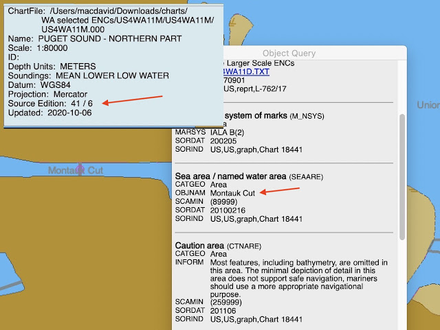
What led us to return to this topic is we ran across a prominent naming error on ENC number US4WA11M (Puget Sound, Northern Part) that mis-labeled Montlake Cut at the west end of the Ship Canal that leads from the Puget Sound via the Ballard Locks into Lake Washington. On that chart it was called Montauk Cut—a famous maritime name for sure, but from NYC, not Seattle. Chart US4WA11M is scale 1:80,000, which is within the scale band 5 that spans scales of 1:50,000 to 1:150,000.

Here is the location we discuss within Puget Sound, followed by the object of interest shown on a chart.


This is the object as we first found it, with an insert showing the chart ID. This is viewed in OpenCPN, showing part of the "cursor pick" display seen when right clicking the Cut—this is the way you access object data on an ENC. The more general chart info shown is usually at the bottom of the display, seen with a click on the chart bar.

Montlake Cut can also be seen on scale band 5 chart US5WA13M, which is 1:25,000. If we zoom in to that scale we see that the Cut and Bridge are labeled correctly on that chart, so the only issue is US4WA11M.  


As noted above, at one point NOAA/OCS had a dedicated webpage for reporting chart errors, but they have updated that, now combining chart error reports with their generic page for comments and questions that we find at 


At this page, we select the Report an Error tab, and then just go down the line of entries.


There is a full NOAA interactive catalog in the right side panel, so you can find the exact Lat-Lon of the error with a button click. You can then include a screenshot of the error. 

I do not know how long the error on US4WA11M was there, but I noted it on Monday, Nov 2, 2020 and sent in that form at about noon, Seattle time.  I was surprised to then get this back at 3:35 PM the same day:

From: NOAA Coast Survey Customer Response for Ticket #148408 

3:35 PM Monday, Nov 2, 2020


Thank you for your inquiry into NOS products.  You are right, the name of the waterway was incorrect on US4WA11.  It has been revised in our database from Montauk Cut to Montlake Cut.  An update for US4WA11 (Edition 41, Update 7) should be available for download within a week.  Again, I'd like to extend my thanks to you for pointing out this error, so that it could be corrected.


Sincerely,


[name given]


Original Message:

-----------------------------------

"Good day, I would like to point out that on US4WA11 the Montlake Cut is misprinted as "Montauk Cut." This does not show up on US5WA13, as noted in the attachments. Please let me know that you have received this, and if you can, please give me an estimate of when we might expect this to be corrected.  Thanks very much. David Burch / Starpath School of Navigation / Seattle"

I am not sure when the actual update was made, but three days later on thursday we checked by doing a chart update for US4WA11M, and found the following:


So we see that it was indeed already fixed!  The new one is edition 41 /7. We can go the charts list to check when it was actually made (see link at www.starpath.com/getcharts):


It looks like the new update was issued on the same day of the report and actually built into the zipped ENC file on the next day. 

I doubt we can expect that type of turn around in general, unless it is a simple one like this one that is easy to see and fix. But they do have the chance to issue a new update every week.

If you see things on a chart that are not right, or you have documented info to improve the charted data, then this is an easy way to submit it. Our feeling has always been that even though the ENC take some practice to get used to, in the end they will be superior to the RNC and offer mariners very much more information about the waterways.

Note added Nov 23:  Another way to follow up on your proposed correction is a new webpage they have on  weekly chart updates: 


It takes a bit of practice, but you can look for updates per date nationwide or home in on specific charts or specific weeks.  A nice new edition to these modern times of weekly updates.  This may not be an advertised public site yet, but it is active.

Before submitting your proposed correction, it could be, depending on the correction, useful to check the latest USCG Weekly Notice to Mariners to see if the error has already been reported. And indeed, if the error is potentially hazardous to navigation, you might also report it to the Aids to Navigation office of the local USCG.

We have related ENC notes online at  Naming and Boundary Conventions in ENC.

For more details on the structure and use of ENC, see Introduction to Electronic Chart Navigation.


Wednesday, November 11, 2020

Into the Weeds with Abbreviations

There is a nuanced twist to navigation terminology that is ever more likely to be confronted... if you might care to ponder such things. It relates to a hierarchy in the specificity of abbreviations. 

mb, Pub., WA are abbreviations. We write them as letters and then read them or pronounce them as the words they stand for, "millibars," "Publication," "Washington."  We can think of these as abbreviations, level 1.

GPS, ENC, COG are initialisms.  They are abbreviations we read and pronounce letter by letter, without saying, or maybe even knowing, what they stand for. We might call these abbreviations, level 2.

And then there is RADAR, ECDIS (pronounced "ekdis"), ATON (pronounced "ay-tahn"), which are acronymsThese are abbreviations that have been elevated to actual words that we pronounce as they are spelled.  Level 3!

Beyond this tidy arrangement, there is at least one loose cannon floating around the nav station.

NMEA, representing the National Marine Electronics Association, is often used as an acronym, which for some unknown reason is commonly pronounced "neema," which has nothing to do with what was once an unambiguous acronym (NIMA) for National Imagery and Mapping Agency  (1996 to 2003) that had replaced the Defense Mapping Agency, known by the initialism DMA.  NIMA was replaced with the NGA, the initialism for National Geospatial Agency, which serves an expanded function today, including the production of many useful nav pubs.

Years ago we proposed the name "erble" be used to elevate the abbreviation for electronic range and bearing line (ERBL) to an acronym. This does make reference to it more tidy,  but I am not sure if this ever caught on much. The longer the abbreviation, the more attractive an acronym becomes.

We got into this abbreviation minutiae today as we prepare our new online course on echart navigation, which focuses on ENC, electronic navigational charts. These are the vector charts that will replace all traditional paper charts and RNC (raster navigational charts) by the end of 2024, which is not that far away — it is now Nov 10, 2020, and many folks are at this moment well aware of  how long 4 years is!

Everything displayed on an ENC is an object, and every object is described by several attributes. Every object on the chart has a 6-letter abbreviation: landmark is LNDMRK, lateral buoy is BOYLAT. We learn what these attributes are when reading an ENC by clicking the object, called a cursor pick, which brings up a list of the objects at that point (usually several) as well as their attributes.


The attributes are also each given a 6-letter abbreviation. Thus, object BOYLAT has attribute BOYSHP (buoy shape), which has 8 possible values; attribute CATLAM (category of the lateral mark), which has 4 possible values; plus attributes for color, color pattern; etc.  There are 27 possible attributes of an object BOYLAT, which you can see defined at this online
ENC Object Catalog from Caris.

One of the first things we might note on that wonderful Caris reference, is they call the abbreviations "acronyms." For the most part, this is not right. We might get by with BOYLAT or CATLAM, but what about the crucial object used to describe rocks: UWTROC (underwater/awash rock). The vast majority of the abbreviations for objects and attributes are awkward at best to pronounce. Caris cannot be blamed for their use of the term. The International Hydrographic Organization  standard for ENCs (IHO S-57)  calls them "acronyms."

The point at hand here is that some abbreviations for objects and attributes will nevertheless inevitably become acronyms right out of the box, such as the attribute that nearly all objects have called SCAMIN (scale minimum,  maybe pronounced "ska min"). You must be zoomed into a scale equal to the SCAMIN or larger in order to see the object on an ENC. Recall that chart scales are defined as ratios: 1:40,000 (1/40,000) is a larger scale (fraction) than 1:80,000 (1/80,000). A lateral beacon (BCNLAT) with a SCAMIN of 44,999 will show up on a 1:40,000 display, but will disappear off the chart when you zoom out  to 1:80,000.

But I wander into the charting here, when the topic is abbreviations. The point is this: as we learn more of the 500 ENC objects and the 400 ENC attributes that can be used to describe them, we will first confront the fact that they look the same, each abbreviated with 6 capital letters, then we will most likely bump around a bit as we decide which of these should be honored with acronyms, and if we want an acronym for an abbreviation we can't pronounce, what word do we invent for it—in the spirit of NMEA.  

If we have friends working in the government, we can ask them for help. They are experts at this... think of NOAA (noah), but that is just an ice crystal on the tip of the iceberg of government speak.

For completeness, I might note that the IHO has a standard for what must be in an ENC called IHO S-57 and another standard on how this information should be presented to the mariners, which is called IHO S-52. In the latter they discourage the use of the abbreviations for objects and attributes in lieu of  full names that they refer to as "human readable language." 

Consequently, many echart programs do not use the abbreviations at all, however, my own work with ENC has shown a certain value to having these available. OpenCPN, for example, uses both the abbreviations and the full names for the objects, but only abbreviations for the attributes. Other programs do not use abbreviations at all.