When viewing an official electronic navigational chart (ENC), the user selects three depth contours (shallow, safety, and deep) and also sets one specific depth value called the safety depth. These four choices affect the colors of objects we see on the chart, as well determining several other features of the chart display.
The safety contour is the most important one as it separates what is called the safe water from the unsafe water. It will trigger alarms and it determines when isolated hazardous objects change from their normal symbol into the prominent isolated danger symbol, which is determined by the requested safety contour and not the displayed contour, which are often different. This takes some attention, but that is not the topic at hand.
We deal here with the safety depth, a simple number, not a contour on the chart, and thus something simpler than the safety contour — but not quite as simple as a first glance might imply.
The most notable effect of the safety depth is to change the color of the soundings. All soundings on the chart that are less than or equal to the user selected safety depth are shown in black, whereas all soundings deeper than the safety depth are shown in a less notable gray shade.
In this example, we wanted a safety contour of 35 ft, so we set the requested safety contour to 35 ft and also set the safety depth to 35 ft — it is generally good practice to make these equal. But in this chart there was no contour at 35 ft, so it chose the next deepest contour as the displayed safety contour, which was 60 ft. The safety contour is always shown as a bolder contour.
Our choice to also set the safety depth to 35 ft changed all soundings deeper than that to the less prominent gray, leaving the serious ones we care about as black. In this chart, the displayed safety contour does not very well mark the waters we want to avoid, but we can now see this fairly clearly by the color of the soundings.
That is the main job of the safety depth. All soundings will respond to this color demarcation, including those that are part of another symbol.
And often, even usually, that is all that is ever said about the safety depth choice: it determines if a sounding is gray or black. We have likely even said in our own early discussions that this is what the safety depth does... "and nothing more!"
But that is not really the case. In working on our forthcoming new booklet called Electronic Chart Symbols: An Annotated ECDIS Chart No. 1, we were reminded that the all important generic hazard symbols for wrecks, rocks, and obstructions with known soundings are indeed supposed to change background color from blue to transparent when their sounding is greater than the user selected safety depth.
Below are a couple samples.
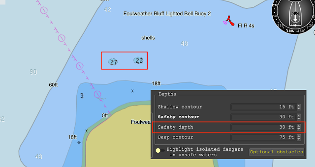
Here we have two generic hazard symbols with known soundings. These could be rocks, wrecks, or obstructions. We do not know till we cursor pick the symbols.
They have soundings of 27 and 22 ft. The cursor pick report of the right one is shown. The safety depth has been set to 20 ft, so both of these rocks are deeper
than that so the symbol is transparent.
Now, we leave everything the same, but change the safety depth to 30 ft. In other words, we consider water 30 ft or deeper to be safe, but these two rocks are only 22 and 27 ft under the water at tide height = 0.
The effect has been to change the soundings color to black, but also notable it has changed the hazard symbol from transparent (less notable) to a blue that will always stand out.
All the common generic hazard symbols behave this way. They are all identical dotted ovals with the sounding inside. They look the same but they could be a rock, a wreck, or one of many kinds of obstructions.
 Summary: Left hazard has sounding deeper than the safety depth; right hazard has sound equal to or less than the safety depth. The hazard could be rock, wreck, or obstruction.
Here is another example.
These five examples of submerged hazards with known soundings are all rocks, but we would not know that without cursor picking each one to get its properties. These could be wrecks or obstructions. In this view, the safety depth was set to 10 ft.
The chart samples shown here are from the free nav app for Mac or PC called qtVlm. We use it in our Marine Weather course and in our course on Electronic Chart Navigation. qtVlm has a top of the line presentation of ENC that adheres to the IHO standards on symbols and functionality.
Below is one final example with practical aspects.
On the left we choose a safety contour to match the shape of the bank, which could be useful for depth piloting, with the safety depth equal to the safety contour, which is standard procedure in many cases.
But if we are in a sailboat with an 8 ft draft, then we might consider 12 ft as a safe depth, and with the safety depth set to 12, we see the hazards we need to miss as we cross the bank as close to the island as is safe.
A subtly of this symbol convention comes to play in the shallow water between the shallow water contour and the foreshore when using a 4-color display or between the safety contour and the foreshore when using a 2-color display, because the official fill color of the danger symbol is the same as the water color in that region.


No comments:
Post a Comment