Tuesday, December 25, 2012

It's Raining — What Does That Mean? Part 2

This note is a follow up on Part 1, and there is a Part 3.

Part 1 Covers definitions and background
 

Part 2 Gives an example of rain at the border between Light Rain and Moderate Rain

 We now have a tipping bucket rain gauge and can be more specific in the study. Our goal is to teach a practical interpretation of rain intensity that will help with our own observations as well as maybe assist the VOS program once we get a good database established.

The original motivation came from a long-distance outdoor skate (The Red Hook Haul Ash... can be done bike or skates.) During the last event it was raining at just 0.04"/hr and we got soaked, and it seemed that such a light rain would not do that... etc.  But it turns out that remarkably low inches per hour is really a lot of rain. What is  called "heavy rain" would better be called amazingly heavy rain, etc. See earlier article on terms.

We spent Christmas with a nice steady 0.10 to 0.13 inches per hour of real rain. That is, it was not showers, which would mean it could be different a few blocks from here. Thus, besides our own gauge, we have other data from the neighborhood that supports the intensity. Namely the roof top gauge at UW and the Seattle RainWatch program, another UW product. Picture below is from UW roof.

This is accumulated rain, so the  steady slope means it was constant, and if you divide 0.45" by 4 hours you get the 0.11 or so we experienced here, 4 miles away.

Below is a capture done too late that shows the screen from Seattle Rain Watch. To use this neat site, set the  picture to "1 hr pcp" and choose "local metro." This one shows lighter gray for under 0.10, but at the time of our test it was dark gray, meaning solid at or over 0.10, or higher, but we did have our tests and US data to show it was really 0.10 to 0.13. They have animations showing the rain moving, and forecasts.

Now for the data:

Here is what 0.10 to 0.13 looks like in a puddle.


Next, we see what this looks like on the water, from a distance off. Notice that it barely shows, and has only a slight influence on visibility.


Finally we look at 0.10" per hour on a windscreen with windshield wipers. We include this example because mariners of ships and power-driven vessels often use rain on the windscreen as a gauge of intensity for reporting rain fall intensity. Our goal is to build up a data base of this type of video for various rain intensities.  This will take a while, but we will plod on with it as best we can.

Notice the difference between the car (vessel) underway and stopped with regard to apparent rain intensity. Moving at higher speeds you get more rain on the windows.  This car was moving at about 12 kts, maybe a bit faster at times, which is compared to stopped twice.


End of story. The main point to make is even what appears to be significant rain is actually still a small number, ie 0.10 inches per hour.  Put the other way, 0.50 inches per hour is a real downpour. Now that we have our neat gauge, we will get some data to demonstrate this.

By the way, the folks who have really studied this subject are those who have invented automatic windshield wipers. They need multiple ways to decide how often to wipe the screen. I just learned that their patent apps have many interesting graphs of their studies, using read values of inches per hour intensity, so we will try to sort that out and include some here with this.


First Pressure Check on Lacrosse C86234

We have a new Lacrosse weather station model C86234 from Costco. On sale for about $60, list is some $280. Seems to work well so far. (Did a rain gauge check today at about 0.1"/h for 3 or 4 hours, and will write that up shortly. Rain study is the main reason we got the device.  It has a tipping bucket gauge that is wireless for about 200 ft, to a temp and humidity gauge that is then wireless for an additional 80 ft to an electronic panel, which can then be accessed up to 30 ft by BT to a PC.

We obviously have barometers coming out out ears here, but the pressure was easy to check quickly with online resources, which we explain here home units can be checked as well.  We are  in sight of the WPOW1 NWS station here, so that is an easy comparison. You can download their data for past 24h and paste into a spread sheet.  The 24h data is UTC; the onscreen data is local or UTC. WPOW1 great plot of the pressure and trend and even pressure plus wind.  The Lacrosse barograph display on the device is not very useful, but you can download the data to PC, but the process is a bit clunky, and the connection is lost if you close the program.  But it will make a plot or you can export to txt and import to excel.

Here is the plot from today at WPOW1. We did the fit backwards in time, so for comparison, I add another flipped over and stretched to match the excel output.


Next we imported both sets of data to excel and then subtracted them. This is a crude test as I am not 100% certain on the times as I had just set up the lacrosse and had to guess a correction since it had stored data with the wrong times in it.... but this does not really matter, it just means it will be easier if done properly.
This is both sets of data overlaid, so we see at a distance that they comparison is pretty good at least on a cursory level.  Small, short-lived  trends are well reproduced. Next we show the difference, with the scatter marked off which is about ± 0.3 mb, centered at -0.3 mb.  I would guess we are slightly higher than that, maybe -0.4 or a bit more.  We can check that later. In any event, first pass their barrometer looks pretty good over the range 1000 to 1020...especially for $60! 

On the other hand, most electronic units will work well over that range.  It is outside of this that is the bigger challenge, ie P > 1025mb and P < 990 mb.  We will know this soon and post a follow up or amend this one.

We can later take this in to our calibration bench and test it there, but the main point of this exercise is to demonstrate how you can do this quickly by comparison to a nearby station.  If you do not have a nearby station, you can interpolate with our online free function at www.starpath.com/barometers.

Next we  will add part 2 to our ongoing notes on rain now that we have a tipping bucket rain guage at hand.


Monday, December 17, 2012

A Local Mini Surge

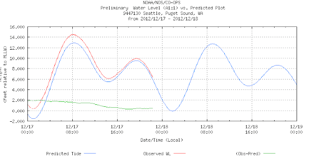
The day after writing about the Sandy surge, we get our own local mini surge, which did flood some low lying  waterfront homes. Again, it was a very deep low, with strong winds that hit the Sound near a spring tide. Winds were 30 kts, pressures down to 978 mb, and predicted tides at 12 ft.. The surge added just over 2 ft throughout the tide cycle, peaking at about 14 ft.

The main effect of the surge however took place a few hours before high tides when the winds were strongest and the pressure lowest.

Here are the pics. (I do not need to add that this was not influenced by climate warmed higher sea levels! By the way, you see Puget Sound sea level history here.)

 Here is the strom about 4 hours before high water (as forecasted the day before)

Here are winds and pressure. Peaked at about 30. Low pressure was about 975 mb

Here is wind direction. At high tide, the winds were SW which is onto the beach in the two pictures of high water that follow.


 Notice that the surge ( 2ft above normal) actually started at low water beore midnight, but it did most damage about 6 am at peak wind time.


These canal front homes were flooded. They are at the entrance to the Locks, just around the corner from the next two pictures.


In the above pic the tide height is about 6 ft.... from another day.


This is 9 am on surge day, the tide was about 14 ft at this point (2 ft higher than predicted), but notice the debris that got pushed up earlier in the morning when the tide was much lower but the waves were bigger.  This is an example of tide and wind almost in phase, but not quite.  Had they been truly in phase the flooding and damage would be higher.


Friday, December 14, 2012

NOAA Chief Misspeaks on Sandy Surge


I am a strong supporter of the work of NOAA, especially the NWS, NHC, NCEP, and NOS. We praise their work daily, and teach students how to use the many excellent resources and services they provide. But once in a while, spokesmen of even the best programs can wander off the trail. According to a chief NOAA spokesman:

"Storms today are different now because of sea level rise. The (Sandy induced) storm surge was much more intense, much higher than it would have been in a non-climate changed world."

This statement is very misleading, which has led me to write this note.

Climate change and global warming and the associated rise in sea level are very serious issues that do warrant our attention. Erroneous statements like this, however,  cause much damage, because the media picks up on it, and they spin off into further sensationalism, which just gets worse with cross quoting. They also do not seem to be much into checking what they publish these days.

The interview appeared yesterday on NPR. The NPR interviewer immediately takes the bait, adding: “Even garden-variety storms may someday heave water up to your doorstep...How do we prepare?”  Check your favorite news source  and you will see multiple examples of this—higher sea levels accounting for worse storms and surges.

Later it was stated: "The evidence is indeed piling up that climate change is no longer something that is happening in future decades, and everyone's eyes are glazing over as the scientists are talking about it,"  

And can we blame them for the eye glaze? This statement on the Sandy surge is particularly damaging because it dilutes the true message on global warming. It just provides fodder to those politicians who do not believe in science.

Here is some background on this issue.

The height and extent of a storm surge (which means higher than average waves and tides hitting the beach that bring unusual amounts of water onto the land) is determined by several factors:

1) The strength and direction of the wind. This creates a wind driven surface current that adds to whatever was going to flow in that direction. A first guess is it adds a current of about 3% of the wind speed (but at these high wind speeds, the factor is more like 2% according to recent research), not to mention the dominant factor that strong winds build huge waves. Related to this is the fetch of the waves as they build offshore. A big storm can “trap its fetch” and bring much larger waves than a smaller system that is moving diagonal to the beach.

2) The tide height itself. This is a bit circular, because in a sense surge is unusual tide height, but clearly if a storm hits at high tide it will have a larger net affect than if it hits at low tide. On the other hand, a long-lasting, large storm will inevitably hit at one of the high tides of the day.  If it hits at a time of month that has a high tide to begin with, i.e. new or full moon near a solstice in many parts of the world, then you start out with high water, and it takes less extra water to go over the barriers.

3) Low atmospheric pressure adds to the tides. This is called the inverse barometer effect. It was known to mariners in the 1800s, though they did not know the cause. We cover this interesting affect in The Barometer Handbook. It adds 10cm of tide above the average tide for every 10 mb of pressure below the average pressure.

4) And there are other smaller affects that contribute, such as prevailing offshore currents–if an anomalous current eddy happened to be offshore, it could drive notable amounts of extra water into the region. And indeed the height of the sea level can matter as well.

But this is the main point. She says the Sandy surge was much higher than it would have been in the sea level of a "non-climate changed world."  What does that mean? 

Let us say that means 100 years ago, when the average sea level off of NY- NJ was about 1-1.3 ft lower. The peak water level at NJ was 9 or 10 ft, depending on location, which was about 4 ft of predicted tide and 5 ft of storm-induced extra water (surge). That extra foot of average sea level had very to do with the magnitude of that surge at a particular time. Furthermore, the surge though routinely referred to as a record high for the area was not really that far off of what they have had before, just a little ways down the coast in 1962 (Ash Wednesday Storm, 7 ft water level in Atlantic City, 9 ft in Norfolk VA). The mid Atlantic also had high surge in a 1956 storm. Had these earlier storms had properties like Sandy they would have set records that Sandy did not match.

The point is, the high surge in Sandy was not due to a climate-changed higher average sea level, it was due to a bad storm hitting the beach in conditions that could have happened anytime in history–the only historical difference is Sandy was remarkably well forecasted many days in advance, whereas the terrible Ash Wednesday Storm was not anticipated just a day or two before it hit.

It was not even unusual tides in NJ at the time, contrary to a lot of reports in the news. The high tide was more or less normal. A few weeks different timing and the tide could have been 1 ft higher than it was–clearly ruling out a 1 ft of sea level change as the key factor. Or, had the landfall been 6 hours earlier or 6 hr later, the tide would have been 4 ft lower, with dramatic reduction in effects, again a major influence on its surge intensity totally unrelated to the height of the sea level.

Not to mention the pressure. Sandy did indeed set low pressure records for the region, getting down to 945 mb or so. The mean pressure in Oct for that region is about 1018 mb. Thus we were down 73 mb from the normal, which implies 73 cm of tide. So the pressure alone added some 2.4 ft to the surge.

There have been other storms with very low pressures that reach NE waters, but they usually curve the other way, and head out to sea to wreak their havoc there. The bad luck in this case was an upper air pattern that turned the storm to the left instead of the right. That had nothing to do at all with higher average sea levels.

Here are some pictures to document the notes above.

The storm came ashore at 00z on Oct 30, seen in this document from NHC.
The wind speed and direction offshore on the approach was documented  by an OSCAT satellite pass. Notice the onshore component and huge fetch to the NE.


Here are the average sea level pressures over the NE in October from The Barometer Handbook.


 And the standard deviations from these pressures in October.
The average October pressure is 1018 mb with a SD of 6 to 8 mb.

The pressure drop as Sandy passed was recorded by a NOAA CO-OPS station
The actual NJ tides in October, 2012 show an average of about 4.5-ft high water, but with some high tides as high as 5.7 ft.

The actual tides at the time in the area along with the predicted normal tides are available online at the NOAA/NOS CO-OPS site, which has interesting data for several applications. The green curve is the anomalous component (observed minus predicted) that led to a storm surge.
Notice that 00z on the 30th was high tide, but ±6 hr either side was more than 4 ft lower.

Here are the NOAA records of the rising sea levels due to global warming.


I must stress very clearly that global warming is obviously causing the sea level to rise, and this rise could accelerate with time, and we should be more alarmed about this than many are. It will sink atoll communities, and flood major cities, maybe during this generation.

And indeed, we will see more severe surges and flooding with time because of this. Sandy dropped some 8 to 12 inches of rain on this community, which contributed to much of the damage caused–presumably the "more intense" aspect of the surge referred to in the NOAA quote.  This will  happen on a more frequent basis in the future, not just because of the sea level rise, but also because there are likely to be a higher percentage of intense storms in the future, just as there will be more droughts in other parts of the world.

We must be aware of this and take actions to prepare for it.  But we most definitely do not further our cause by making claims for evidence that is not appropriate. There is plenty of unambiguous evidence to look at.

Indeed, if we assume the tides were about the same 100 years ago–I don't know if that is true or not–then this sea level difference could have enhanced this particular maximum water level by some 10 to maybe 20%, depending on how you define surge and depending on what the actual sea level looked like at the time. It is not uniform in time nor space (compare NY and NJ data above). Recorded data are just the annual averages.  But I still believe that implications of statements like this run the risk of doing more damage than good.

And here is one final caveat to consider. "Surge" is most reasonably interpreted at the rise of the tide above the predicted values. The predicted tide heights are based on the known average sea level at the time. Therefore, by definition, sea level cannot have any influence on surge at all. Higher sea level just causes the high water of the normal predicted tides to gradually get higher with time.  In short, intelligent, useful conversation on these topics will require more specific terminology.

It would be interesting to look at a plot of the maximum high tide over these last 100 years–a number we can all understand and interpret properly–rather than average sea level offshore, which is a much more complex concept.  It is rather like comparing the phone book, whose data are right or wrong and easy to check, to the Bible, from which you can prove whatever you want.


Thursday, December 13, 2012

Great Circle Sailing by Sight Reduction

It is not often we need to know the route of shortest distance waypoints (great circle route, GC) from one position to another on the globe, because usually wind or other matters dominate the routing. But sometimes we do–more often than not, when we are taking a navigation exam for some license or certification!

The best practical solution is just type the Lat-Lon of departure and destination into an electronic charting system (ECS) or a computer or calculator program and it will give the results immediately.  The basic results are the distance between the two points and the initial heading of the route (in GC sailing the heading changes continuously along the route). To apply this route, however, we need waypoints along the route since the heading is changing. This is usually accomplished in these programs by telling them a longitude interval, and then the program tells you the Lat at each of these Lon intervals along the route–in other words, a set of waypoints.

Another parameter often given out is the vertex of the route, which is the Lat-Lon of the highest Lat along the route.  Since the GC route only differs notably from the rhumb line route (RL) for high Lat at departure and destination, we often find out that the vertex hits the ice, so we can’t use this route anyway!

If you do not have an ECS device to compute the basic data you can get all the answers by drawing a straight line from departure to destination on what is called a great circle chart or plotting sheet. Then just pull off the waypoints with dividers from the grid on the chart. The distance can also be summed up this way in steps along the route. Places like Captains Nautical Supply sell GC Plotting Sheets.

Without ECS or GC plotting sheets we are left to compute these things on our own. This can be done from the basic spherical trig equations used in cel nav, or we can use the sight reduction tables that celestial navigators use to solve routine position fixing from sextant sights. The best set of tables for this application is Pub. 229, and at this point we will have to assume you are familiar with these tables. This application is standard for the most part, but you will see we need a couple extra interpolations not usually called for, but in principle always a small improvement.

We just do a sight reduction but replace the Assumed Position (AP) with the Departure (dep), and replace the Geographical Position (GP) with the Destination (dest). In other words, the sight reduction process tells us the angular height (Hc) and azimuth (Zn) of a star viewed from the assumed position (a-Lat, a-Lon). And we know that the zenith distance (z = 90º - Hc) is the distance from the AP to the GP, so the GC distance is just z converted from angle to nmi at the rate of 1º = 60 nmi. Zn is then the initial heading (always poleward of the RL heading).

Let us work an example: What is the CG distance and initial heading from 13º 12’ N, 49º 35’ E to 15º   04.6’ N, 54º 49.2’ E?  This brings up the point that we can use this procedure to figure the course and distance between two points, even if we do not care if there is any difference between CG and RL. This example is at low Lat and short distance, so there will not be much difference in the two solutions.

Dear Reader: at this point you have to decide if you really care about this subject, because it gets more tedious from here on.

a-Lat = dep. Lat = 13º 12’ N
a-Lon = dep. Lon = 49º 35’ E

dec = dest. Lat = N 15º 04.6’ (We write the N in front when calling it a declination.)
GHA = dest. Lon =  54º 49.2’ E = 305º 10.8’ (see below)

Now we spot a bit of a twist in the process. The GHA is measured 0 to 360 headed W from Greenwich, whereas Lon goes 0 −180 W and 0 − 180 E from Greenwich (Lon = 0). So we have to convert our dest. Lon into the equivalent meridian labeled as if it were a GHA.

(For example, 20º W Lon is just GHA = 20º, but 20º E Lon would be 360 − 20 =  340º GHA. To get to the meridian of 20º E, i have to go west 340º.)

So Lon 54º 49.2’ E = 359º 60’ - 54º 49.2’ is the same as GHA = 305º 10.8’

Then following regular sight reduction procedures, we figure the Local Hour Angle (LHA) = GHA + a-Lon(E), where we choose minutes of a-Lon so that they add to GHA for a whole degree, thus a-Lon  = 49º 49.2’  so LHA  = 305º 10.8’ + 49º 49.2’  = 354º 60’ = 355º

Next we choose an AP with whole degrees since the tables only have whole degrees of a-Lat and LHA. In this application we can just round them off to get a-Lat = 13º N and LHA = 355º, and we note that since our declination is also N, we have a Same Name solution.

Now we enter Pub 229 with a-Lat = 13 N, dec = N 15, and LHA = 355 same name to get: Hc = 84º 45.2', d = −26.9'* and Z = 067º, and since the Hc is so high, we need to get Z from a-Lat = 14 as well and it is Z = 057.6. In other words, when bodies are high in the sky, any small change in anything changes the bearing, so we will have to interpolate for 13º 12'. (d = altitude difference, and the * means a dsd correction is called for, but we are skipping this for now.)


ie Lat interpolation for consecutive declinations gives:
Zn = Z = 67.0 + [(12/60) x (77.7-67.0)] = 069.14 for dec = 15 at Lat 13º 12'
Zn = Z = 66.9 + [(12/60) x (66.9-57.6)] = 068.76 for dec = 16 at Lat 13º 12'

Now interpolate for the minutes of dec (which at 04.6/60 should be small)
Final Zn = 069.14 - [(4.6/60) x (69.14-68.76)] = 069.1º and that is the initial heading of the GC route we are after.

To find distance we have to finish getting an accurate Hc. With dec min = 4.6' and d = −26.9’ we get the Hc correction in three parts from Pub 229, but we can skip the dsd correction and just add the tens (1.5’) and units (0.5’) corrections to get 2.0’, which is negative, so we have Hc = 84 45.2 − 2.0 = 84 43.2. 

Altitude difference (d) of  26.9 means tens = 20, units = 6, decimals = 0.9, and you get total correction as shown below.


Then z = 89 60 − 84 43.2 = 5 16.8, which converted to nmi = 300 + 16.8 = 316.8.  But this is GC from the AP not from the departure, so we have to make a correction, which is best done by plotting.


Here we see where we computed from (AP = center of plotting sheet) and where we were at the same time, and thus had to add the projected distance (red line) to what we got. This step could also diminish the earlier result. There are several forms of cel nav plotting sheets that can be used for this. See some in the support page for our cel nav text.

After plotting we see we need to add another 9.5 nmi for a total GC distance of 316+9.5 = 324.5 nmi

——————————

Alternatively, if you know these formulas and have a trig calculator, you can get the result this way:


lat = 13º 12' = 13.2º,
dec = 15º 04.6' = 15.077º
LHA = GHA + Lon = 305º 10.8' + 49º 35.0' = 354º 45.8' = 354.763º (we do not need to use AP when doing a direct computation.)

and sin Hc = sin (13.2) sin(15.077) + cos(13.2) cos(15.077) cos (354.763) = 0.995539
or solve the arcsin to get: Hc = 84.5862 and z = 90-Hc = 5.41378º then x 60 to get GC distance = 324.8 nmi.   Our plot and table work was off a hair.)

And:
tan Z = cos(15.077) sin (354.763) / [ cos(13.2) cos(15.077) - sin(13.2) cos(15.077) cos(354.763) ] = -2.6172338039, and solving for the arc tangent:
or Z = Zn = 069.09º, which is what we got from the tables (069.1).

Notation note: cap Z = azimuth angle, lower case z = zenith distance, true bearing or azimuth = Zn.

The above formula is what the programs use. It is obviously much easier to use a calculator that has these formulas already programmed in. We offer a free calculator for this at www.starpath.com/navpubs.

=========

PS. The above note is for doing GC computations over large distances (without a computer!).  If the run you need to compute is less than 500 miles or so at low latitude, you can get a good estimate more easily with mid-latitude sailing. That is:

Solve a right triangle with one side = dLat = 15.077 - 13.2 = 1.877 x 60 nmi = 112.62 nmi

and on the other side take the departure as dLon x cos (mid-lat)

convert to decimals
= (54.82 - 49.58) x cos [(15.077+13.2)/2] = 5.062º x 60 = 303.7 nmi.

Then the run is the hypotenuse = sq root (112.62^2 + 303.7^2) = 323.9 nmi  compared to 324.8,

and the course is then E xx N, where xx = arc tan (112.6/303.7)  so xx = 20.3º, and CMG = 90 -20.3 = 069.7 compared to 069.1

========

Summary:  after you pass all of your tests on these subjects, buy a calculator that will do all this for you... and much more.


Thursday, December 6, 2012

Tactical Use of Scatterometer Data

We will be watching the tropical Atlantic winds very closely for the next 3  months as we assist in the tactical routing of the OAR Northwest expedition from Dakar to Miami. This will bring up many examples of the value of scatterometer winds, about which we have several posts. Here we will just document a few as we proceed, starting with the one below. We highlight the importance of this analysis in our text Modern Marine Weather.

The top picture is our best surface analysis map of the ITCZ (doldrums) just SW of Dakar valid at 18z. The closest ASCAT pass (hi-res from KNMI)  is some hours earlier at 1030z, but this pattern does not change rapidly and our point for now is just to show the type of detail we can see. Searching around the data, we can often find cases closer in time.

The blue rectangle marks the region shown below in the ASCAT data.


The surface analysis does not tell us much about the winds at all, but we can guess that since this is the ITCZ, we would expect the NE trades to be meeting the SE trades, as they are indeed doing. This we see from the ASCAT winds, but notice how much more detail we get.  If you are rowing or sailing in this area, this is tremendously valuable information. Notice how the zone really splits up wind-wise on the eastern end of the region measured, which we have no idea at all about from the surface analysis alone.

Below we see the GFS model wind for 18z, which is effectively a surface analysis for this 18z run, but we do not learn much from it. In short, the scatterometer winds are the most precise wind data we can get at sea... or get at home for a particular part of the ocean.


This is the end of this example. We will add more as we run across them or share ones we actually use in routing.


Study  on your own 
To make a comparison of this type on your own for any location:

(1) get the top picture: opc.ncep.noaa.gov/UA/Atl_Tropics.gif

(2) get the middle picture: knmi.nl/scatterometer/ascat_b_osi_co_prod/ascat_app.cgi

(3) get the bottom picture: passageweather.com/maps/arc/mappage.htm