you see a list of files and each file has a number, sequentially from 1 to about 2,041, which must represent about how many US ENC there are at the moment. Note that these are file numbers not chart numbers, which are listed beside this file number.
Inserted at several places in that list you will see file numbers listed as "cxl" as shown below.
We have learned that these charts with file number cxl are ones that have been replaced by reschemed charts, but for continuity they are left on this list for a period of time. They will eventually be removed as they are now outdated.
The header text inside these charts indicate this status, and some electronic chart systems (ECS) read that and then refuse to open these charts, as they are indeed now outdated. qtVlm, for example, posts an alert that you tried to open a chart that has been canceled by an update. Other ECS will open these charts without warning they are outdated.
To learn which reschemed charts cover the region you are trying to access with one of these older charts, use this link to go to that area to see the new charts available.
The reschemed ENC are very fine products with notable improvements over the existing versions; we look forward to more of them. Progress in the program can be seen here
Traditional paper charts are in the process of being replaced with electronic navigational charts (ENC) and a new form of paper chart called NOAA Custom Chart (NCC), based on these ENC. In this new system, the user designs and creates a high-res PDF file of the paper chart they want using the NOAA NCC online app, and then it is up to the user to get these printed. Existing print-on-demand (POD) outlets will likely play a major role in that process, especially for commercial and government applications, but there are also other options that might meet the needs of many mariners. There is a video at the end of this post on the process of creating an NCC PDF.
We keep in mind here that the desire for having the paper charts is for many just a secure backup to the primary navigation done with the electronic charts, and the backups can be in other sizes and papers than are used in the traditional paper charts. The present POD traditional charts are all of standard, fixed sizes and all on high-quality heavy paper. A major virtue of the NCC is we can choose the area we want to chart, it does not have to match existing charts, and it is up to us to choose the size and quality of the paper.
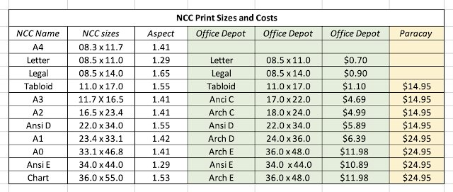
There are several nuances to creating the NCC, such as scale and depth contour choices and the location of compass roses that we cover in a separate NCC design video and is not the topic at hand, which is the printing. Below is a summary of the products we can create and print.
It takes some thought and practice to get the paper size and chart scale to best meet our needs, which is discussed in the video, but we will want to keep in mind how we are going to print the chart as we make those decisions. A couple things to note in table above.
First, "Paracay" stands for Paradise Cay Publications, who are an official POD chart distributer in California who have agreed to print NCC for users even now, as mariners are just learning this new system. They use high quality paper and have efficient shipping methods in place. Charts printed there will have the correct scale and be on paper we are accustomed to in traditional nautical charts. There is a fiducial marker strip on the bottom right of each NCC that can be used to confirm the printing scale. Likewise on the bottom left there is the intended dimensions of the final product.
Since this was first published, we have two more POD printers who have joined in, and indeed took the lead in that they have instructions on their websites on how to do this. Later we will expand the above table. It is worth looking over the print sizes, papers, and costs from each. See
Needless to say, all remain excellent sources for traditional paper charts, which will be available for many charts for the next year or maybe two. EVG also has an extended source of international paper charts as well as ENC and RNC.
The process of ending the traditional charts is an ongoing one. It is not that they will be discontinued on the magic date of Dec 31, 2024; rather they will all be gone by that date, some of which are already gone. Many will be gone by Oct 5, 2022. The phrase they use is Sunsetted."
Next, "Office Depot" is here used to represent several commercial printers across the US. Office Depot (who acquired Office Max) has by far the largest number of outlets, but Staples has similar options, as do several smaller chains or individual outlets. Some FedEx Office outlets can also print these, but their prices are notably higher. I emphasize Office Depot because we have actually made several test prints with them with good success.
It is clear from the table that there are less expensive options to traditional chart printing that might meet some needs. What stands out is the tabloid size of 11x17 for about $1. With this new system, not only can you define the area you want, but you can also create a series of charts all the same size, to make your own chart folio set, which in turn could be coil bound. These new charts can also be laminated, or indeed printed on exotic papers such as waterproof or even Tyvek.... these would be from another source and we are in the process of confirming that they will take part in this program.
To print NCC in the letter, legal, or tabloid size, a good approach that you can try right now from any place in the US is just login to www.printme.com and upload your NCC PDFs, enter your zip code to find the nearest printer, and get the code for the job, which you can then tell the printer. They also give driving instructions to get there!
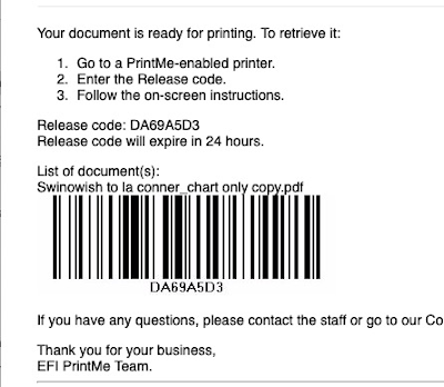
You will get back in the email a notice like this
which includes the code you need. Then at the Office Depot, you can use the self service printers by just entering this code. This expands the access to get a print (tabloid or smaller) because the Print Department in the stores have shorter or sometimes irregular hours compared to the full store.
You can still use the self serve printing without the prior file delivery to printme.com because you are given the option to email it to them from there... or use your thumb drive copy.
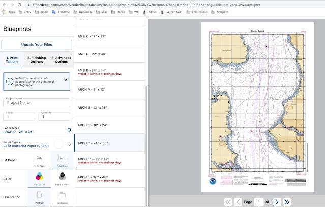
Beyond the tabloid size, the trick to printing at Office Depot is these NCC charts can be printed in the Blueprint category, which is much less expensive than their poster category. To print these larger charts, or in fact any size, copy them to a thumb drive and take that to the local Office Depot. Larger than tabloid cannot be transmitted with printme.com. Tabloid size paper (11x17) is sometimes called "ledger."
Another option is just email the chart files to yourself as attachments and open the mail in your phone to get the files into your phone—or move to your phone by air drop or other means—and use your phone to take them to the printer. At that point, you can mail them to the print desk as you stand there. Or check with the printer. Each store has a unique email you can use once you make arrangements with the print desk. In the long run, a thumb drive (available at Office Depot!) is likely more efficient than using your phone as a thumb drive.
You can also do it all online, once you find your way to the Blueprint section. A sample of the interface is below:
Once done you can then buy it and either pick up at the store or have them ship it. If you have the charts shipped, it could pay to check Staples options. The printing is about the same price, but the shipping is much less—checking today, Office Depot shipping is ~$10 and Staples ~$5, with the latter offering a 2-hr courier delivery at $15 (we are in Seattle, about 10 mile from this printer).
Some home printers can print 11x17, but it might still be hard to beat the $1 price of having it printed for you. They are using 28# paper for these, which is heavier than most of us have in house, and their colors are calibrated, and they don't run out of magenta!
The 22x34 is also a very nice size for a sailor's chart table. Remember that we almost always have to fold a traditional chart to use it on the chart table in the nav station, so now we have the option to print that same chart as two charts each the size of our chart table... or maybe we only need a limited section of this chart, so we select it out for the NCC design.
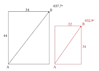
When printing these charts you have the choice with the printer to keep the original size (aspect or shape) or fit to the paper size. We want to always choose to keep the original size, and print on larger paper if needed, then just trim off the blank margins. The 11x17, 22x34, and 34x44 have exact matches on the commercial printers. But if we want, say, the A0 size of 33.1x46.8 we would choose Arch E at 36x48 and just trim it. Below shows the distortion in bearings by printing one one aspect ratio and printing on another.
Letting the printer fit to paper can distort the mercator projection so bearings measured from it will be incorrect. This would not be an issue if the aspect ratio of what you created, say 1.55 of 22x34, matched the one you chose to printed on, say, 11x17, or vice versa. This should not affect the bearings or distance measurements, but technically, one would have the wrong scale by a factor of two.
Here we produce a chart on 22x34 (aspect 1.55) and decide we want to print it larger at 34x44 (aspect 1.29) or vice versa. It is the same chart on two different paper sizes, comparing the bearing from a point in one corner to the other, we see we get a bearing error when not on the right paper. This can be computed as bearing = atan(34/44) = 37.7º or atan(22/34) = 32.9º. In short, we want to print on the size stated on the bottom left, or one that has the same aspect, ratio of length to width.
(Note this is not a precise description because the print size refers to the paper size, not the chart size, and the margins are not the same width top and bottom, but the bearing discrepancies are about of this magnitude for this aspect difference.)
For the higher quality paper using a professional chart printer like Paracay, the price depends only on the shortest dimension of the chart. For 22 inches or less on the shorter side the cost is 14.95, and for larger than 22 on the short side, the cost is $24.95, up to 42 inches wide on the short side, regardless of the long dimension of the chart in both cases. They also have very good shipping fees: Media Mail is $3.50 for any
number of charts or $10.50 for Priority Mail.
___________
A Note on Compass Roses
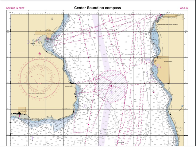
The NCC program has several known issues they are working on. One is the presentation of compass roses. They have an option to include or not include compass roses, but if the area you have chosen to chart does not include a compass rose on the native RNC, then none shows up on the final product, and the variation is not printed on the chart.
If the chart has one or two compass roses, you can choose to add them, which may work out just fine. In some cases, like this Center Sound example, adding the roses adds too much clutter.
When compass roses are present and you choose to not shown them, we get these small magvar symbols with the variation noted beside it. It is there then, but not a very satisfying solution.
For those who want to do a bit of extra work, we can capture the compass rose from the set up page and then paste it into the PDF. This operation can be carried out in Mac using the Preview app. In a PC, you can add images to a PDF with the free Inkscape app.
Below is a sample of manually pasting a compass rose into the chart above.
We a free online app that will make these compass roses for you based on a known variation with a transparent background that you can then paste onto the chart where you want it. See link at starpath.com/NCC. This can then be used as we learn how this issue will be resolved by NOAA.
____________
Evaluating a couple samples
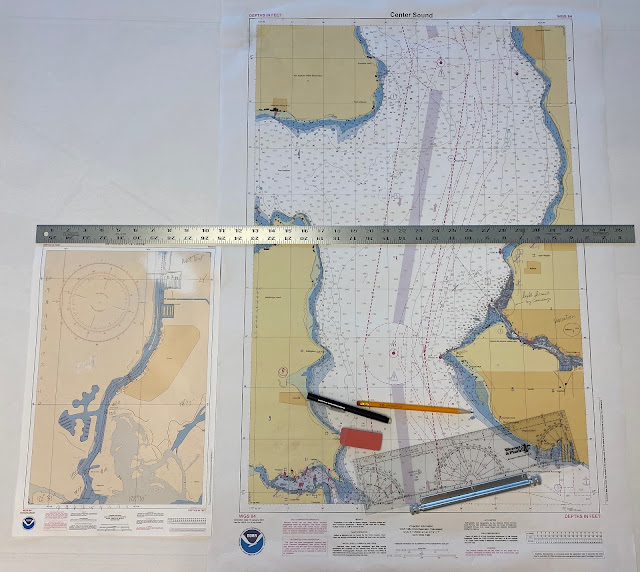
Bellow we see two we printed at Office Depot. One at 11x17 (at 1:5,000) and another at 22x34 (at 1:25,000). You can click the image, right-click it, open in new tab, and then zoom for details.
The printing and colors are excellent, but it is still important to make such tests to see what meets your needs. For strictly back up, these should be fine, but even at 28#, the paper is not nearly as durable as the chart paper you can get at POD outlets, such as Paradise Cay. We did a study of chart paper when wet (What Happens When Nautical Charts Get Wet?), and Paradise Cay paper did a superior job. You can even smash them up into a wet mess then dry them out and iron them. These stock Office Depot charts will not handle water, essentially at all. Both ink and paper fail fairly easily. There are lamination options to consider, which might work depending on application. It is about $4 to laminate one... or put on special coatings.
We also did a video on Erasing Property of Print on Demand Charts, and the better papers did well on that, but these simple paper charts do not erase as well. Doable, if we use lighter lines, but not as good as the traditional POD charts.
In short, the quick print outlets at lower price may well meet the needs of many mariners, but traditional POD outlets will be likely be our primary source for paper charts intended for routine use.
As you practice with these now, remember the program is still in the development stage. NOAA is working on several ways to improve the products. In the above chart on the right, for example, we see that the density of soundings obscures at least one important light, so it would be nice to have an option to turn soundings off or at least de-clutter them like most echart programs can do when viewing the ENC—or in this particular case, these soundings have a SCAMIN of 11,999, which means they should not show at all for scales smaller than that. We are looking at 1:25,000 so they should not be there in the first place... at least in ENC terms. The program does have a nice way to label the depth contours, which might be enough for many applications.
A polar diagram is a graphic presentation of a sailboat's sailing performance in various wind conditions. The same information is also often presented in the form of a table or spreadsheet, which is how the data are originally collected or computed, which in turn is then plotted on a polar diagram as shown below. Programs that compute this data are called velocity prediction programs (VPP).
This is a polar diagram from a specific Farr40 as it appears graphically in LuckGrib above, which includes multiple polar diagrams in its routing function, plus the option to import custom versions.
Below are the same data in table format. Here we learn that this Farr40 sailing in a true wind speed (TWS) of 20 kts at a true wind angle (TWA) of 135º should in principle have a boat speed of 11.85 kts. We can read this from the diagram, but get more precise readings from the table. As discussed below, these are theoretical or target speeds based on yacht design. It is up to the navigator to determine if these are realistic values or do they need to be modified to match actual performance.
A convenient combination of this information can be presented in a navigation program that does a digital interpolation of the table and diagram simultaneously, as shown below in this example from qtVlm, another large source of polar diagrams.
In this qtVlm display, we set the true wind speed (to any value, does not need to be in the original table data), and then putting the cursor on the diagram creates the blue line which can be moved to the desired TWA as the corresponding boat speed and other data are shown on the right. This app also has a table view, but it is mainly intended for editing the polar, since it can double interpolate as shown here (i.e., any TWS or TWA) to get specific values.
We see here also extra output that is common to polar diagram presentation, namely the prediction of the best performance directly upwind and directly downwind, as illustrate below.
This display shows what your best TWA is when your destination is directly upwind or directly downwind. For this Farr40, in 10 kts of TWS, the best upwind TWA is 41º at which time your boat speed should read 6.9 kts, and your actual progress up wind, called velocity made good (VMG) would be 5.24 kts. You would tack back and forth till you reached the layline to the mark.
The same is almost true when sailing downwind, but there is a difference. Sailing upwind, by definition you would always be sailing the optimum upwind TWA for that TWS. Unless there are environmental or tactical reasons to do otherwise, that is the way you best progress upwind—and any target that is not on the layline is by definition upwind. In other words, you would always choose to sail upwind at the TWA that is right where the red curve meets the green curve on this polar diagram presentation, because that is best speed upwind. In the real world, one tack might be faster than the other, which affects this decision, but we are not considering such perturbations for now.
Sailing downwind, if the target is indeed dead downwind, then you would again sail the TWA recommended where the red meets the green, jibing back and forth across that line. For example, if the true wind direction (TWD) were 070, blowing toward 250, and the rhumb line course to your target was 250, then that is what you would do for best performance—again assuming speeds were equal on both jibes and you did not have other reasons to favor one jibe over the other.
With this Farr40 in 10 kts of true wind this means we would want to sail at TWA = 150, which we achieve at a heading of 220 (30º to the left of the direction the wind blows toward) where we expect a knotmeter speed = 7.6, and a projected speed downwind of VMG = 6.6, which we assume will be the same on both jibes.
In practice, however, the target is not likely to be dead downwind, so the job is not to maximize the speed downwind (VMG), but to maximize the speed in the direction of the desired course, called velocity made course (VMC). It is the projection of the speed you are sailing onto the direction of the desired course, as shown below.
Speed over ground (SOG) and course over ground (COG) are direct outputs from the GPS. The course to next mark (CNM) is computed from the boat's present position and the Lat-Lon of the destination.
We can go over a couple numerical examples of finding VMC from the polar diagram, but in practice this VMC is usually found by experimentation under sail, because all instrument systems can display the VMC being accomplished, as determined by the SOG and COG from the GPS and the known heading to your desired course, CNM. It is a simple, accurate computation that does not depend on anything difficult to measure.
Following up on the example above, let's say the desired course was not dead downwind at 250T, but instead it was at 220T, which is 30º to the left of dead downwind. Our first reaction looking at the polar data shown above might be "Lucky us; our destination is right on the heading that gives maximum speed downwind." But things are not quite that simple; on closer look, that is not the optimum heading for our destination. We have several ways to figure that out directly from the polar plot, independent of what nav program we use.
Recalling that the polar is aways oriented in the direction of the wind, we can think of looking across it in the direction we want to go, as shown above. The best TWA downwind was 150, meaning with wind at 070 we steer a heading of 220, which yields a best VMC = 6.6 kts, but if our destination is actually at the course of 220 (not 250 which is dead downwind) the best TWA = 135, which we achieve at a heading of 205, yielding a best VMC of just over 8 kts. Again, we do not often need to solve this ahead of time because we can find it experimentally as shown below, but it can help to understand the concept. We can get more precise values from a spreadsheet as shown below, where the "polar speeds" shown were interpolated from the qtVlm function mentioned above.
Most nav apps offer more direct ways to determine the optimum VMC. qtVlm, for example, lets us draw the polar right on the screen that matches the existing wind forecast, or we can mock up a case with its Force-wind option (Grib config/Corrections/Force wind) set for this example to 10 kts from 070. Then we can draw various lines to look at options, as shown below.
This presentation of the on-screen "speed polar" shows both sides, where as typical presentation is just one side. Some nav apps have a way to think through this and display the optimum VMC without special setup (see qtVlm's pink arrow below), but in all cases we still have to go to the approximate heading we think is right and then try 10 or 15º either side to see what maximizes the VMC. Note that the max values cover a fairly broad range of TWA and the sea state will always have an effect on this. Below is an illustration of this using the qtVlm simulator.
Beside watching a plot of VMC vs time, qtVlm shows two arrows on the microboard at all times, one showing heading to the course and the other (pink one) is optimum VMC taking into account wind, waves, and currents. Below is a short video (5:43) showing where the above data came from.
When sailing an ocean route downwind, one of the ongoing concerns is "Are we on the right jibe?" Keeping track of the optimum VMC is one step to answering that, but as the wind changes and the boat speed changes, we also have to think through what this value would be on the other jibe, and these basics might help with that if you do not have digital tools that display the opposite jibe VMC at all times.
The text files for most polars require a CRLF (carriage return, line feed). Exporting an PC excel file with MS DOS txt format adds the proper CRLF at the end of each row, but Mac Excel seems to put just a CR. If you get an error message from a program such as "polar does not have sufficient data" it could be do to missing LF. You can check this in a PC by loading the file into Notepad++ and then View/Show Symbols/All Characters, as shown below.
In a Mac you can use terminal command "cat -e" to check this.
macdavid@iMac Downloads % cat -e etap39.csv
twa\tws,6,8,10,12,14,16,20^M$
0,0,0,0,0,0,0,0^M$
46.5,4.61,0,0,0,0,0,0^M$
45.8,0,5.42,0,0,0,0,0^M$
The ^M$ is the correct CRLF symbol: ^M is the CR and $ is the LF
Sources of Polars
The programs Expedition, LuckGrib, qtVlm, and others each have an extensive set of polars included. The set within Expedition has been popular amongst racing sailors for many years, but many of these are also found at other sites.
ORC Sailboat Data has a lot and lets you see them graphically, and compare for same boat.
iPolar is a $10 iOS app that creates a very basic starting polar based on boat specs. You can get the needed boat specs for most boats from sailboatdata.com
The goal is always to build your polar with actual measurements, but we often have to start out with some stock polar, and the closest one we find might not have data at the low and high ends of the TWA and it might not have data for higher or lower TWS. Below is an example we found that illustrates this.
We have fairly good TWS coverage, but not good TWA going only from 52 to 150. This polar is shown below loaded into two different navigation programs that do optimum sailboat routing.
The actual data in the polar are those between the yellow and orange lines, but each program has filled in the missing data using some VPP approximation, heuristic, or simple rule.
The one on the right has a simple rule. For low wind angles, it is a linear interpolation from last data point in the polar to 0 kts at head to wind (TWA=0). It does not look linear, but that is all due to the polar plot. On the downwind end, this program assumes the boat speed remains the same at all TWA aft of the last known value, TWA= 150 in this case. As such, during a routing computation, it will favor dead downwind for optimum VMG, which is not likely right at lower TWS. Note too that this accounts for the apparent kink in the curves. That is not real; it just reflects the intersection of a fixed circle and a curve.
The computed polar on the left uses a heuristic approach, making stronger fall offs in boat speed for lower TWS. At medium and lower TWS either one of these two polar approaches might be closest to the truth, depending on the boat and sails.
The point being made, however, is both polars include some region of not real data, so after a route is run it would pay to check how much time is spent in no man's land of the polar. One way to protect yourself from getting routed off to the real no man's land, is to limit the TWA angles in the routing to say, for this boat, no closer than 50 upwind and no farther than say 165 downwind.
But the main job in a case like this is be sure to start collecting real logbook data that directly lets you improve your polar data and especially fill in the missing angle ranges. For a given TWS it would not take long to learn both ends and then just add them to the polar. We want in the logbook columns for TWA, TWS, boat speed (STW), plus sails set and maybe notes on sea state. Your wind instruments might give you this directly, and if not then you need heading (CTW), STW, AWA, AWS, and from these you compute TWS and TWA. In either case all instruments must be well calibrated: AWS, AWD, and heading sensor, and if heeled you need to know the heel angle. See Modern Marine Weather.
One easy way to fill in the gaps is to use an app like iPolar to get a rough prediction of the curves then scale them to what you think are the right data from your starting polar, and then you will be using some combination of VPP and heuristic to get starting values for the missing data.
There are also sophisticated tools such as Polar Manager that let you then load both the stock polar and the iPolar approximation and then manually average them to some common factor... which then awaits your confirmation with real data.
I hope to have data shortly to make a demo of creating a working polar for a cruising sailboat, starting from a rough base computed in iPolar.
Scatterometer wind measurements are the truth meter for weather work at sea. There are several sources, but the ASCAT data from EUMETSAT are the gold standard. We can see this data graphically at the STAR website—found easily with a Google search of "ASCAT." We have extensive coverage of this data and how to use it in Modern Marine Weather (MMWX), but the book links are out of date (being updated here!)—in part because the satellites have changed. A is now gone and we use Metop B and C.
This article has been updated from its origin on May 2021, with new videos at the end.
So the first news is we have the updated links below, there are new data, and it is even better than before. The main bad news is the GRIB format of this data, which offered a super convenient and precise way to test model forecasts is at present no longer available from the Ocean Prediction Center (OPC). It is still listed at the OPC website, which might imply the loss is not permanent. The files look normal and are indeed updated as indicated, but they do not contain any data!
Granted, this wonderful source of digital data could only be conveniently viewed in two popular commercial programs, namely Expedition and LuckGrib—not to mention the free app Panoply, since that one takes extra work. Worse than that, even amongst the many users of these two leading programs, there were not many navigators actually taking advantage of this most important data, which might account for the lingering loss... ie there are not many people complaining.
(For now, there is no GRIB source for ASCAT, but for those who want it enough to spend some extra work you can download the data in netcdf and then view it in Panoply, but this is not a practical, navigator's solution.)
*** Note added in July 2022: LuckGrib now offers ASCAT once again. They are doing the conversion from netcdf to grib on their own. To our knowledge this is the only grib source of ASCAT data.
Part of the problem in ASCAT popularity is the data are not plug and play like a GFS forecast is, for example. Once we did get the ASCAT grib, life was good, it showed the actual winds on the ocean, not a forecast, but real data as if we are looking at anemometers on a field buoys located every 25 km across the ocean. The problem is the data over some specific point, say 300 nmi in radius, might only be updated 2 or 3 times a day, and those times take some effort to predict. Refer to MMWX for these details.
The good news is, and the motivation of this article is, we have a new, free way to get georeferenced ASCAT data into a navigation program when underway using the program qtVlm. We already had one way described in MMWX, namely look up the file name for the data you want from the STAR site or from the table in MMWX, and then request that image from Saildocs. Once that is in hand, and you check the valid time of the satellite pass (MMWX), you can either just look at it to see the winds and compare to the forecasts, or in Expedition, OpenCPN, or qtVlm you could manually georeference it and then overlay the model forecast at the corresponding tine right on top of it. In these programs you can store the georeference coordinates and then just periodically update to see if there is new data. The image size you are requesting is 20 to 60m kb. A sample is below.
ASCAT-A descending over Bermuda at 12:33z on May 2, 2021. It is May 2, and not May 3, because this image is from the 22-hr dataset that was most recently updated at 02:07 May 2. Had the small purple time at the bottom been between 00:00z and 02:07z then this would be May 2. (From the original article; A is no longer available.)
These files are always 10º Lat x 15º Lon so they are easy to georeference, plus the grid lines are clearly in view.
Below are samples georeferenced in Expedition and qtVlm with the GFS wind forecast at the corresponding time overlaid on it.
And then zoomed in below, we see the GFS is pretty good since it agrees with the scatterometer wind measurements. This is Metop A, descending.
The same thing viewed in qtVlm looks like this:
The best comparison of overlaid data like this depends on our choices of transparency and wind barb colors. This has not been optimized in either of these two programs.
The main new good news from qtVlm is their latest version allows us to enter a live internet link for the image, as opposed to a link to a static file on our hard drive, so that the data are updated automatically when we reload that image. The trick is to create an auto-updating KML file for image and then use that as the target file. This then not only updates automatically, it also brings with it all of the georeferencing information. With your computer linked to your satellite phone, this update should take place just as you do to obtain the latest model forecast.
We have videos online on how to do this. We make the needed files in Google Earth, which is then another way to look at live, auto updating ASCAT images. The new step is just adding this functionality to a navigation program independent of Google Earth.
We made such KML files some years ago for the Bermuda Race, Transpac/Pacific Cup, and for Sydney-Hobart. Our next step will be to update the links and make a convenient place for mariners to download them. Now that we have lost the GRIB format, these methods become of interest again.
Here is the generic image link using the Bermuda file as the base. Then the colored letters have to be changed for other locations, passes, and satellites.
Change A to B or C for the 3 ASCAT satellites, and change the blue file name to match the location you care about, and then change the d (descending) to a for the ascending pass.
Thus for each location you care about, there will be 6 files that might be of interest, keeping in mind that A and B are fairly close in time so the earth has not rotated much between them. In rare cases, you might need B having seen A, but not often.
You can get these files (once you know the name of the ones you want) from Saildocs. For example, send an otherwise blank email to query@saildocs with this as the message: