Friday, January 4, 2019

Navigation Exercise: Crossing Currents

In an ongoing article about crossing the Equatorial Countercurrent (to be posted shortly) we confront a classic navigation exercise in optimal routing through and across currents. More often than not, there are external factors that dominate how we choose to cross a current, but it is valuable to have in mind the fundamental results for comparison.

The problem is illustrated below. The situation looks idealized, but as it turns out, the values are fairly realistic—we are for now disregarding the performance of the vessel (assuming a constant speed on any heading) and also ignoring the constant equatorial currents of 1.0 kts flowing the other direction on each side of the countercurrent. We will come back to that reality, but as first guess we assume that does not affect our solution to this problem.  The vessel in this case is a custom single-handed rowboat, on its way to Cairns, AU, after departing from Neah Bay, WA about 5 months earlier.


Figure 1. Pacific Equatorial Countercurrent of 1.0 kts spreads over a band about 200 nmi wide. In some parts of the ocean in some seasons it could be twice this wide. Sometimes it does not exist.

We start the computation from a position along the rhumb line route that is 300 mi off the top edge of the current band, and ask for the fastest time to get to the finish line, which is defined here as any point on the line shown that is equidistant from Cairns, or more generically, on the line perpendicular to the course line, since Cairns is indeed more than 4,000 miles away from this point!

Assume the vessel can take any route, but maximum speed is 2.0 kts.  We are looking for an answer that is a number of days, hours, and minutes, plus the actual route proposed. It will take some review of current sailings, but that is by no means a hint.

Standing by for answers by comment or email to helpdesk@starpath.com.
__________

Here are a couple starting points.
If there were no countercurrent at all, the trip would be 300 mi to the current edge, then staying on the rhumb line (RL) course at 240T, means we are on a 30ยบ right triangle with the sides of the current  so there are various ways to compute the distance across, but there is no point in doing that. We can layout this route and current band in a nav program such as OpenCPN and just read off these values. Or plot it on a piece of paper at some random scale and measure it that way. How we come up with the distances does not matter.

In this case the RL distance across the current is 400 nmi for a total distance of 700. At 2 kts, this takes 350 hr = 14 days 14 hr.

The time to get across the current is going to be longer, so the question is how much longer and how does this depend on our heading while crossing.  There are several choices.

(1) You can drive up to the current following the RL (300 nmi) then crab acoss the current heading into the current the right amount to make good the RL course. This means we will be still be going 1.5 kts through the water, but at some up current heading that lets us make good some slower speed but keeps us tracking along the RL. This is a standard vector problem in navigation. Find heading and resulting SMG that yields a CMG = RL course.  There are analytical as well as graphic solutions.

(2) Another choice would be to just enter the current when we hit it without changing course. We will then get set down stream by some amount and after we emerge from the current we  have to make it back to the finish line.  This is also a standard problem: how much do I get set in a know current; that is, given speed and heading as well as current set and drift, find SMG and CMG.  Then DR back to the finish line.

(3) A kayaker might first think of computing the total set during a straight-across paddle, then head for a point that far up stream from where the RL enters the stream and the paddle straight across. You will then get set right down to your RL track when you exist the current.

(4) And there could be other solutions... maybe some combination of these pure solutions.

The reader's goal now is to choose a method and solve for the total time, and see what you come up with for the shortest time?  Give your time precise to the minute as we will likely get more than one right answer, and it might come down to precision of computation.

The winner will receive a signed copy of Emergency Navigation.

We will wait until Feb 1 to see what answers we get, then post our solutions.  Note that even if you are wrong, if you are the only submitted answer you win!

Later we can also think on whether our answer depends on the speed of the boat or the speed of the current, or the ratio of the two, or is the fastest approach true for any circumstance?  Observation: there is at least one national sailing organization certification exam that believes there is only one answer!

Another part of this query, since we already know of at least three different approaches, is to ask if there is some general principle that directs us to the right solution, which would then save us testing the numerical values of the other solutions?  This would presumably be some argument from math or physics.

The solutions are online in another article.


Thursday, December 13, 2018

Squall Forecasting in Puget Sound... Maybe.

We had a very pleasant surprise visit in the office today from sailing and weather expert Bruce Hedrick, during which the discussion of local squalls came up, which reminded me of an example from a couple months ago, which at the time seemed to me a peek into the future of squall forecasting.

This one occured on Sept 16, 2018,  during the J&J race from STYC. It started with a bike ride home in the afternoon noting what fine sailing weather we had as a race was going on in the Sound, off Shilshole Bay. Then once at home I saw the same fleet hit by a sudden squall, which was gone in 15 min or so.

Perhaps one of Bruce's racing column readers was sailing that race and can tell us more about what they observed. This took place between about 1:15 and 1:30 PM, on Sunday, Sept 16.

At the time I made a video to document the observation; this note is a summary of that video, which was longer than needed... too much talking!  Plus a couple new notes. The boats affected that I saw were at the location of the vessel icon in the picture below.


The thought that occured to me at the time was: did this squall show up in the new forecasts of simulated weather radar? These forecasts are available in the HRRR forecasts, and promise to be a key parameter for inland and coastal sailing, in that they should be able to forecast squalls in an easy to understand manner.  This parameter is also available offshore in FV3-GFS data. We discuss this parameter and how to use it in our textbook Modern Marine Weather, 3rd Ed.

Much of the HRRR data is available from third party sources beyond using direct access from NCEP, but to my knowledge the only GRIB viewer that can seamlessly download and then display this special parameter is LuckGrib, available for Mac or iPad, which we used for this study. The only nav  program I know of that will do this is Expedition (v10.9.17.1 or newer... a 10.9.18 beta).

Below we see that the wind over this part of the Sound prior to the squall was well forecsted by HRRR which we can tell by comparison with the NDBC winds from West Point Lighthouse (WPOW1), shown below... captured from the video.


This shows the wind at the time at west point was 12 to 16 kts, and when we look at the HRRR winds at this time below...


12:30 PM HRRR wind forecasts about 14 kts from the south agrees with what is seen over the area.  Then in the video we step forward slowly to see below at 1PM


Here the cursor is over the squall showing reflectivity of about 39 dbZ, explained shortly in a table below.  Then 30 min more at 1:30 the squall is gone, and the wind is back to about what it was, but a bit lighter, which is actually seen as well in the lighthouse winds.


This forecasted squall was not at the right place... i.e., where I saw the boats encounter it.   It was about 5 to 6 miles south of the observed area... but I must say I could only observe the area marked above; i do not know what happened in this region to the south.

But this forecasted squall was about at the right time, maybe 15 min earlier.... if of course there was any real correlation between this forecast and this actual squall.  There is another note  to make about conditions at this time on this day, but first let's look at a page from our text book that describes this simulated radar data and gives a real, confirmed example from Spain.

Here are a couple pages from Chapter 4 of our book that shows the reflectivity scale that we made to use with this new REFC data.  This is not official in any sense. We made this as a guide to interpreting weather radar images for all types of rain, and then apply it to this data.

The REFC values we saw in the forecast were about 39 dbz, which is on the border between showers and thunderstorms—I do not recall any rain with this system;  maybe we will learn something from those who actually experienced it.

In any event, if we were planning this race before the start, we could have looked at the HRRR data and maybe even the NAM CONUS (3 km)—not every one offers this latter model, but LuckGrib does, and we would have seen something more generally like the one capture below.


The forecast was for very unstable air with  showers crossing the region.  With LuckGrib you can mark a point and ask for a meteogram of any parameter. Here is what the REFC looked like in that part of the Sound.


 For what it is worth, we see that the likelihood of squalls peaking out right at race time!  Again, though, this could be all coincidence.

The instability of the air at race time, however, was documented in another, rather dramatic manner caught on film from the parking lot at Fred Meyers. This was filmed at almost the same time I saw the boats affected, but again, there is not a direct link. I have lost the reference but my FB page says it was identified as "about 1230." Not sure where that came from.


But here is the bearings we checked when we saw this:


This is the perspective in the video of the cloud.


This then extends across or toward almost the identical location that I was watching the squall hit the boats.  This is clearly circumstantial evidence. We have no specific distance information from the cloud image. It could have been over the Fisherman's Terminal. But such clouds do indicate notable instability, and the squall that I saw was a clear example of that.

So that is the story. Next step is to start using this REFC data to check conditions before races to see if we can learn more.

And again, if anyone was in that race who can share some experiences, please post a comment or call us at the school 206-783-1414.  Thanks.

PS. LuckGrib now has a full functioning free trial period for Mac or iPad, so folks can experiment with these exotic GRIB files... plus get access to the best wind data available.

Wednesday, December 12, 2018

Satellite Cloud Images — Underway Sources

Satellite data are crucial to modern marine weather. The most direct use we have comes from scatterometer wind measurements that give us surface wind speed and direction worldwide. We get near-live measurements somewhere close enough to us to be helpful for navigation planning every few hours.  Google ASCAT to get to the main page of graphic data. We can also get the ASCAT data in GRIB format.

The ASCAT data are from satellites in low polar orbits. The earth rotates below them, so they eventually look down upon all points on earth in their typical 103 minute periods. Other satellites in these low orbits measure sea surface temperature and the height of the sea surface, which can be used to compute ocean currents. We also can get the resulting ocean current forecasts in GRIB format.

Another type of satellite is in a much higher orbit specifically chosen so it circles the earth at exactly the same rate that the earth rotates below it. These are called geosynchronous satellites. They are effectively fixed in space relative to the earth, always viewing the same hemisphere below them. These are the satellites that give mariners a detailed look at the cloud cover every hour or so. The United States, Europe, and Japan offer GOES (Geostationary Satellite Imagery) data. The NOAA GOES Server provides access to many of the available images, and these are the primary source for the images that  can be requested by email underway—some are available in reasonable size, others are too large for frequent download when underway. All are available by HF radiofax.

Satellite cloud images are not often the primary source of weather information we need for decision making underway. Primarily we need accurate wind forecasts. But in some circumstances clouds provide crucial information that enhance our understanding of what is taking place and what to do about it.  In the presence of tropical storms or prominent fronts, the cloud images are the truth meters that tell us where the systems are.  The models and the forecasters tell us where they think they are, but the cloud pictures and the ASCAT wind data tell us where they really are.

Cloud images are much like radar.  Electronic tools on our echart displays can tell us from a GPS input the range and bearing to an islet, but that is not nearly so reassuring as the range and bearing we measure on  the radar screen. On the radar we are seeing it; on the echart we are computing it based on other inputs.... the GPS signal, the heading sensor, the chart datum, etc.

Besides getting positive information on our location relative to the system, clouds can also help us understand the winds we are seeing. Fronts do not show up in model forecasts, and sometimes the fronts we see in forecast maps cannot be discerned as strong or weak on the map alone, but the clouds can often clarify that.  Below is a sample (without fronts).


Figure 1. Infrared sat image over Tropical East Pacific (evpn10.jpg). Several areas of convection stand out, which we can study with other tools for tactical information.

In another note we go over how this and other cloud images can be used underway, but for now our main goal  is to provide a roadmap or "briefings page" for the maps available by HF radiofax or by email request from saildocs or FTPmail. There are many options, and the official presentation is confusing. Our goal is to force some logic and understanding onto that system.

And may I say, right up front, this was a tedious task. There may be reasons the system ended up so confusing, but we are hard pressed to see it. We hope that mariners find this "Sat-image Briefings" file a useful tool for accessing the images and knowing what is available.  The outline below shows what we have done; you can then download the interactive file (Sat-Image-Briefing.pdf) to store on your own computer or mobile device along with the Pacific and Atlantic map briefings.

These images can be obtained by email request to saildocs or by direct request via FTPmail at any time, or they can be received by HF radiofax, which requires tuning into the right frequency on the HF radio at the right time. Most of these images are updated 4 times a day, somewhere near the synoptic times so they can be compared to the surface analyses. Some, however, are only offered twice a day on the HF rfax broadcasts. Most are infrared images, meaning the gray scale spectrum in the images represents different cloud temperatures, and since the air temperature goes down with increasing altitude, the color reflects the height of the clouds. The whiter, the higher.  There is, however, the occasional visual image included in the sequence, which is indicated in some of the lists but not all. The visual images have higher resolution. In our presentation, you can assume all are IR, unless noted as VIS.

Below is a summary of all images available, organized by the HF rfax broadcast stations.  The maps are identified by the map areas given on the rfax broadcast schedules, as well as our own (Starpath) ID, which we add to simplify the cross referencing. Each of these maps has a most recent file name, which can be requested by email.

The "most recent" is defined as most recent of those available in the tgftp folder, which will be the most recent synoptic time, or near then.  (The GOES images themselves that are the sources of these rfax versions are actually updated every hour. Later we will show how to access those directly, some of which are manageable in size.)


[1] These schedules were last updated in Sept, 2018. Latest versions are presented in a document that has been called rfax.pdf for so many years that you can find it you google that file name. Various versions of it are also online: one at the OPC and others at weather.gov/marine.  The rfax.pdf file is a preferred source as it also includes (in an appendix) interactive instructions for requesting the maps and images by email.  However, with that said, to highlight the issues we are dealing with, the latest rfax.pdf is dated on the cover "Sept 7, 2018," whereas within the document itself it says the schedules we care about here were updated Sept 19.

[2] The file names listed here are not used at all for HF radiofax downloads, but these are needed to request the files by email.  We list them here for cross reference to the images below.

[3] Images are typically available for download about 30 min after the valid synoptic time of the image. In some cases the actual valid time is 15 or 30 min before the synoptic times listed.

[4] In  most cases, the images are broadcast four times a day, at two specific times, AM and PM, on a 12 hr clock, e.g., NMG images are 2:00 and 8:00, AM and PM, but there are notable exceptions.

[5] From the Atlantic station NMF (Boston), the area covered by image A1 is broadcast four times a day, but in different images (A1 and A2, which includes A1), whereas the rest of image A2 is only available by HF rfax twice a day. You can still get the images by email request four times a day, but there is a twist to using the "most current" file, see [6] below.

[6] When requesting images by email, each image area (P1, T1, etc) has a unique "most current" file name that will send you the requested area for the most recent synoptic time that is available, in all cases except the most current file for the two areas broadcast from NMF (A1 and A2). This most current file (evnt99.jpg) alternates between A1 and A2. At 00z and 12z the file evnt99.jpg will get you an A1 image, whereas at 06z and 18z you will get an A2 image. This is an anomaly that only happens with this one "most current" file.

[7] The two images P1 and P2 are in a polar azimuthal projection. These can be difficult to work with when comparing to weather maps, charts, and GRIB data which are typically in a Mercator projection, but the navigation programs Expedition and OpenCPN are two exceptions in that they automatically download and georeference these as well as they do the other satellite images. The other images are in a rectilinear projection, which is not Mercator, but they do georeference easily in echart programs or Google Earth.

[8] The NWS map area IDs and the regions they cover are listed at the bottom of the rfax schedules. These areas are unique to the individual broadcast stations. NMC Area 6, for example, is a totally different place than NMF Area 6. That is the reason we introduced our own unique labels for these image boundaries—in this example, P1 and A2, respectively.

Below are the maps available from the NWS via email request or HF radiofax broadcasts.


We made this map using the flexible features of the super GRIB viewer LuckGrib. The rectilinear ones we can just draw in based on the dimensions you see below. To get the polar azimuthal boundaries we georeferenced the images in OpenCPN then make a route along the boundary, then exported the routes as GPX files, which were imported into LuckGrib. We use unique features of LuckGrib to study the weather associated with satellite images in another note.

You can see in the graphic above already some structure revealed within this image set. There is a larger and smaller region covered in each ocean. At the end of this note, we have an image that shows that P3 is essentially the full view of the earth from GOES West.

When downloading by email request to FTP or getting them directly online, the files are all located in the directory


You can go to that directory and find the files using the names list below. Each has a most current, which means most current of the synoptic times.


To request the files by email from FTPmail send an email to NWS.FTPMail.OPS@noaa.gov with this message

open
cd fax
get evpn10.jpg
get evst99.jpg
quit

There are two ways to get the images from saildocs with an email to query@saildocs.com.  You can send a URL request to get back exactly what you ask such as

send https://tgftp.nws.noaa.gov/fax/evpn10.jpg

Or you can use a shortcut, which will convert the file to a TIF and compress it at the expense of some clarity. This would be just:

send evpn10.jpg

Below are the two images, first from a direct link to the URL, and below that the compressed TIF version. In a sense, you do not gain much and you lose a lot, which is not too surprising in that this compression service from Sildocs is intended for weather maps, where it works great, not for sat images.


This JPG original file above is 1728 x 1229 at 213 kb.  The TIF below is 864 x 614 but only reduced to 184 kb.


Again, our Sat-Image-Briefing.pdf file includes the basic information above, with live links to the most current images via internet.  You can georeference any of the sat images in Google Earth. The sample below shows that the region P3 is essentially the full-disk view from GOES West.  Later we add how to access GOES West and East subregions directly.  There are also sat images from the aviation weather sector.


Sat image region P3 georeferenced in Google Earth.  If you want this overlay for your own google earth you can get this one we made.


Tuesday, November 13, 2018

Fit-Slope Method to Analyze Sextant Sights

We have been teaching what we named the Fit-slope Method for analyzing sextant sights since 1978, and it has appeared in all of our textbooks since then. Consequently we were pleased and honored that this method was referenced in the latest edition of Bowditch's American Practical Navigator, which in turn led me to realize that we do not have an explanation of this method in public that is easy to reference, although I did post a note related to it. That note, and the Bowditch description, are short, and do not emphasize the key aspect of the method. This note is intended to remedy that.

We also have a new (Aug, 2026) update on the principles of the procedure plus a convenient online app to make the analysis fast and easy.

*  *  *

For any measurement, we always get a more realistic value by making several independent measurements and then averaging the results—or maybe even applying more sophisticated statistical analysis such as least squares.  This is no different in celestial navigation when we measure the sextant height of a star from which we can compute a line of position (LOP) on the chart. We do not want to rely on just one measurement, we want many, so we can average them in some manner.

The problem we have in the sextant measurement is everything is moving. The star is moving across the sky; we are moving across the water; and the clock hands are moving across the watch.  It is not like measuring the length of a board, where we could measure it 5 times and then average the results. In the case of the sextant height of a star, we expect it to be different every time we measure it, so we have to clarify what we mean by an average.

If we were not moving at all, such as sights on land or when dead in the water, then we only have to account for the rising or setting of the star. We will get a set of sextant heights (Hs) and specific watch times (WT). Below is an example of what these might look like when plotted as a graph.
Here we have 3 sights of a star that is descending in the sky. The vertical scale might be 5' per division with say 44ยบ 20' at the bottom and 45ยบ 05' at the top; the horizontal scale might be 30 sec per division starting at say 16h 20m 00s on the left and 16h 24m 30s on the right. To choose the scales, we look at the range of time and range of heights and compare that to the graph paper we have, and choose some convenient scale based on that. This type of data can also be plotted digitally with a spreadsheet (Excel and Numbers are popular commercial versions; Libre Office is a free version), and some cel nav programs like our own StarPilot do these plots automatically.

Over the duration of typical sight taking sessions (20 minutes or so), most celestial sights will follow a near linear path (meaning change in height per unit change in time is constant), providing the celestial body is not crossing our meridian at the time. So our first step analysis without further information is to just draw a line through these points using a manual form of least squares fitting. Namely the line should go through as many points as we can, leaving roughly the same number above the line as below—and maybe ignoring ones that are anomalously off the line as they are likely blunders. With little practice, navigators can actually draw this  "best fit line" as well as a computer program could using a least squares analysis.

When we choose where to draw that straight line, we have two degrees of freedom. We can move the line up and down on the page, and we can tilt the line, which is equivalent to changing its slope. The dotted line above is one choice of best fit. Once a best line is chosen, we can then choose which value will represent the "average" of the sights taken. If the line goes right through one of the points, then we can use it, and that single one will represent an average of all of them.

On the other hand, if our best line does not go through one of the actual sights, we can choose any convenient point on the line and use that for the representative average, as shown in the figure below. In these cases we might choose a point at a whole minute to simplify the later analysis. In the figure above this would be using Hs1 and WT1 to represent the average of all 3 sights, even though we did not take an actual sight at that time. With 5' per vertical interval, we then have to accept that the three sights are about ± 2' off of this average.
All of this procedure described above is what we might call standard practice, and something equivalent to this is used in most cel nav programs. This standard method, however, does not take advantage of all we know about the sights, and as such it often means we are giving up accuracy in our fix that we do not need to give up.  With that in mind,  let's look at the data again.

As we shall see, having just 3 sights is not optimum; we are better off with 4 or more, but with just three it is easier to see the point at hand.  For now we assume the slope is linear, which it is in most sight sessions—and if not, we will be able to know that as we show later. With a linear slope, we can look at these sights as the first two being consistent, and the third one being off.
Or we can think of the last two being consistent and the first one being off.

Or the first and last are consistent, but the middle one is off.  The difference between these conclusions is the slope of the data, meaning how fast does the height of the star change with time as viewed from our location. This slope also depends on the motion of our boat because that changes our position, but we will come back to that detail.  For now, we just assume we are on land or dead in the water.

This brings us to the whole point of the Fit-slope Method.  This slope is not a degree of freedom we have to vary when choosing the best line. We can easily compute this slope and then force our line to have the right slope. In other words, in the three interpretations above, only one is right. We just have to take a few minutes to figure out which one it is.

To do this, we perform standard sight reductions of the body sighted at times (T1 and T2) just before and just after the sight session, using the corresponding DR positions. This tells us what the heights (calculated height, Hc) should be at these specific times. We also get the azimuth, Zn, but we do not use that. These two Hc values can be plotted on the same plot as our data using an offset scale for the heights.  The Hc heights won't line up with Hs heights because Hc and Hs differ by all the standard sextant corrections (index, dip, and altitude). Once the two Hc values are plotted, we can see what the right slope should be.

This special determination of Hc values for the slope is best done by computation rather than using sight reduction tables. This way you can get Hc from the exact DR positions you were at times T1 and T2, which is what we need for finding the most accurate slope. You can compute Hc with a trig calculator using the basic definitions of the navigational triangle, or use a program such as the free Celestial Tools by Stan Klein. If you are online you can get Hc from the USNO—use our shortcut link starpath.com/usno. I would mention using our own commercial product StarPilot, but this step is not needed in that program as it solves the Fit-slope Method automatically.

You can if needed compute the Hc with tables alone (no computers,  no calculators), but it is extra work. Most sight reduction tables in common use require employing an assumed position, which can be as much as 30 miles away from your DR positions. The resulting Hc values are perfectly good for getting an accurate LOP, but the time slope between these two Hc values at different assumed positions is not accurate enough for what we want.
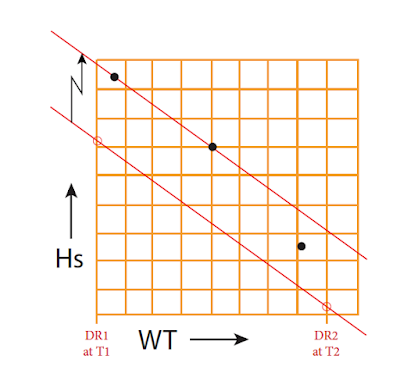


Once we have the slope plotted as above we can use parallel rulers or a roller plotter to move it up into the data to find the best fit.  We are still doing a "manual least squares" fitting by eye, but now the slope is not a variable. In many cases, this helps us rule out certain sights. In this schematic example, sight C is most likely not right, and we are likely best to just average A and B and use that to represent the set of all three. When there are 4 or more sights, the confidence in choice of outliers is more satisfying—or we learn there are no obvious outliers, and we use the spread of differences from the slope line as a measure of our uncertainty in that sight.

This procedure is not a magic bullet in any sense. It is simply imposing onto the data a property that we know (the slope) and using it to help us choose which sights might be less reliable. It is not guaranteed that the conclusions will be right, especially when there are few sights and the spread in values is not large.  But this method does give us a bit more confidence in our choices.

Since we are looking for small differences, it is important when we compute the Hc values to use the right DR positions, which will change during the sight taking session. In class we teach that each sight session starts below decks with a recording in the logbook of the time, log, course, and speed.  Then after the sights are completed, we return to the logbook and record the ending time, new log, and again record course and speed. We can use that information to mark the starting and ending DR positions on the DR track that is already plotted on our plotting sheet.  We had to have that track plotted to predict the time of the sights, and we use it again to choose a DR position for the sight reductions. (See Notes on DR and Sextant Sights.)

To show the influence of this, consider we are sailing 6 kts toward the south, taking sights of a body toward the south over a period of 30 min. Bodies near due south are crossing our meridian, so their height is not changing much with time if we were not moving, but sailing toward it we would raise its sextant angle by 3' during the 30 minutes we are sailing toward it at 6 kts.

Below is an example fix using the fit-slope method. It is from the book Hawaii by Sextant, analyzed with StarPilot. Sights are from a 1982 race, Victoria, BC to Maui, HI, near the end of the race approaching land. No other navigation was available at that time but cel nav. There was a radio beacon there, but it was not helpful for RDF at the time.

Figure 1. Raw sight data of Problem 27. C=232T; S=7.6

Notes from the book: "We are getting close to sighting land. This could be our last chance for a good fix. We do a set of morning star sights. Usually in star sight sessions we add Polaris whenever we have time to do it because it takes no pre-computation. Just set your sextant to your latitude and look north. But in this case it was woven right into the set of all sights, which were alternated in time to get the best fix."

Here is what these sights look like after they have been reduced using a calculator.

Figure 2. Analysis of the sights

This analysis does not take into account the motion of the boat. They are all reduced from the DR given in the Polaris sights. Each is valid at the WTs shown.  Below we plot all of these, adjusting each sight to the time of the last sight using Speed = 7.6 kts and Course = 232 T.

Figure 3. Plot of all sights, adjusted for boat motion. In the StarPilot, the individual LOPs are identified with a mouse cursor rollover.

The light gray vertical and horizontal lines are meridians and parallels, which end up at unusual spacing in the StarPilot plots. Here the two latitude parallels are separated  by 40.9'.


Figure 4. Showing bad Capella sight is way off the slope line (22.7' off) and can be discarded—although we did not need the fit-slope method to know this one was bad.

We see immediately that one of the Capella sights is way off and certainly a blunder, leaving us to look at the other three. Likewise, Vega has one sight notably off the others.  There is not much we can do with the Polaris data as there is no significant slope to its motion. Below are a couple of the fit slope plots.

Figure 5. Capella sights. After discarding the bad sight, the last 3 have more information. Relative to the second two, which are close to the line, the first is clearly higher. In this case, however, the difference off the line is under 1.0' so we probably won't get much difference in the fix from using the last two only or all three. 


Figure 6. The 3 Vega sights. The second is off the slope of the other two by 4.1', which we had indication of from the plot of all LOPs. So for this sight, we choose the average of the first and last as likely the best average for these 3 sights. Without the known slope line, you would have the conditions discussed in the introduction, namely not know if 2 and 3 were right, leaving 1 high, or if 1 and 2 were right, leaving 3 very high. 


Now we can redo the plot of all LOPs employing the choices from Fit-slope and again correcting for vessel motion. This is shown below.


Figure 7. Plot of all sights corrected for vessel motion. Each LOP shown represents the average of multiple sights guided by the fit-slope analysis. This is Problem 27 in Hawaii by Sextant.

My experience is that this method generally improves the fixes from typical sights at sea. In some cases, the choices of best sights to use are obvious. In other cases, we have to look at the full set of sights combined with other sights to help us make a choice.  The method is likely of most value in helping set a confidence level on the fix. If we have four sights and three line up well, but one is off, but just by, say, 1.5', then in many cases we might not feel confident to throw that one out, but with the other three nicely on the line and that one off by that much, we are more confident to remove it. This operation can then leave us with a tighter fix with less uncertainty.

Our book Hawaii by Sextant is one way to practice the method as there are many real sights and fixes included. It can certainly be tested on land, and indeed used by those new to sight taking to help evaluate their sights. You can apply it to a set of sights using a shoreline on the other side of a lake, or use it with an artificial horizon. The application of the method will be good training for actual sights at sea.
______________

To get the ultimate accuracy from a set of sights then requires us to analyze the triangle of 3 LOPs to find the best location, or most likely position, based on the shape and size of the triangle of intersections ("cocked hat"), as well as the standard deviation or variance we assign to each LOP in the set. Often these variances are the same, but when they are not, it affects the best choice.

One of the key outcomes of the fit-slope method is a better feeling for the uncertainty in an LOP based on the analysis of the several measurements we made to get the LOP.  In the above discussion, if we had done no analysis, we would have to assume something like ± 2' for the variance of this LOP, based on three measurements, not counting other information that might affect this value.  After the fit-slope analysis, this variance can be fairly reduced to about half of that, or better.

We have a related discussion called:  Most Likely Position from Three LOPs.