For routing analysis and computations we have several global models we can choose from, as well as several regional models. An important step is choosing what might be the best forecast. Elsewhere we have an in-depth article and video on Evaluating a Weather Forecast, but our first step here is just comparing what the different models forecast.
We will use qtVlm for this, which is the free program we use in our Marine Weather and Electronic Chart Navigation courses. Similar analysis can be done with Expedition or with LuckGrib, and other programs as well.
Step 1. Download the data. We use three global models available from Saildocs, accessible from within qtVlm, but in practice you may choose other products or sources.
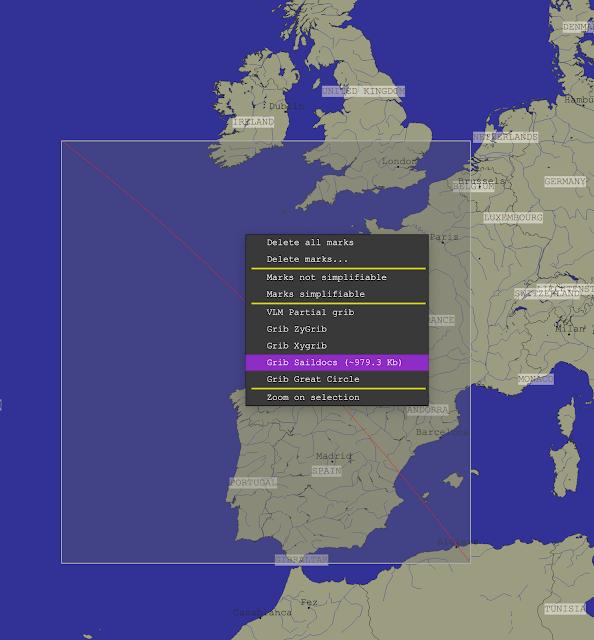
Then select the models (blue means on, yellow means off, for all of qtVlm):
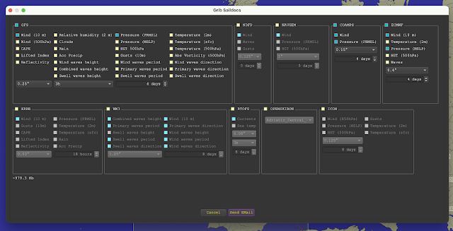
Here we choose wind and pressure from GFS, COAMPS, and ECMWF. We are after wind comparisons, but the pressure can help us understand what is taking place. Pressing send email creates the request we send to saildocs and they send back by return mail the 3 model forecasts in grib format. We asked for the best resolution that each model offers and restrict the comparison to the time interval of the shortest one, namely COAMPS at 4 days. In each case we ask for a forecast every 3 hr.
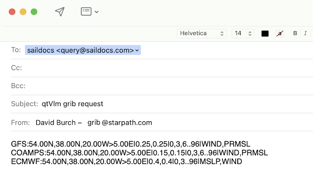
The generated email then looks like this shown below. We could create it manually as we explain in Modern Marine Weather, but the auto generate function is a convenient tool.
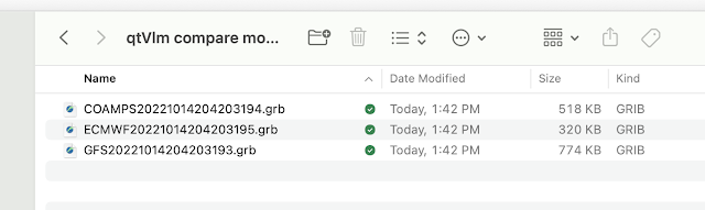
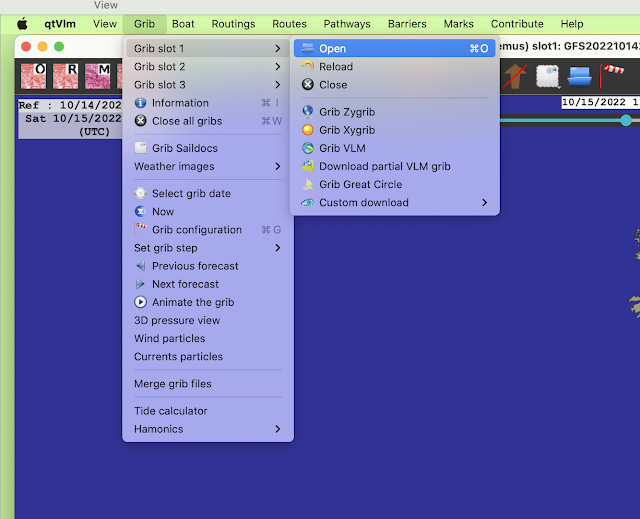
At this stage you navigate to the file in the folder above and say OK. Then do the same with slot 2 and slot 3 for the other two forecasts.
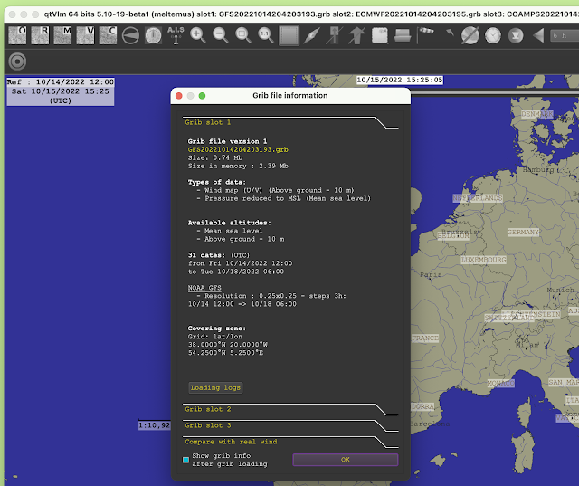
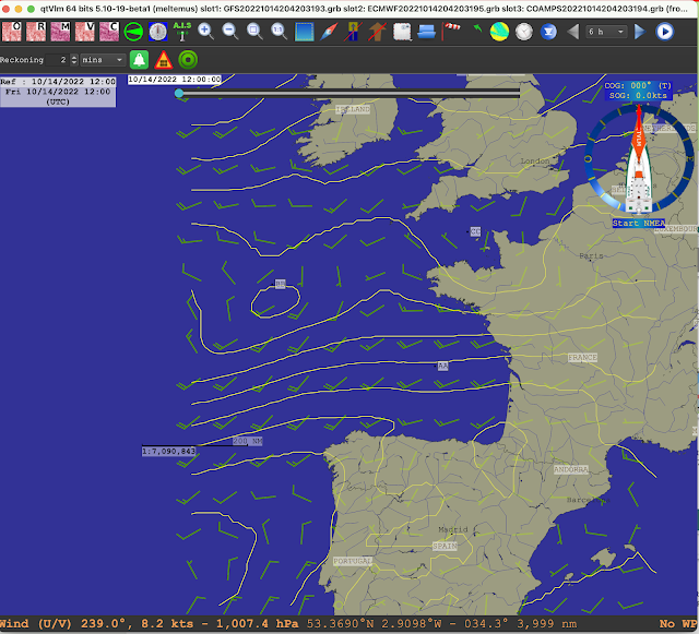
Once all are loaded, they will be listed in the title bar and you can use menu Grib/Grib Information to inspect the contents of each if desired. The wind barbs themselves might not being showing if we do not yet have them turned on.
Next we want to use menu Grib/Grib configuration (windsock toolbar) to set up the wind display to enhance the comparison. Use these settings:
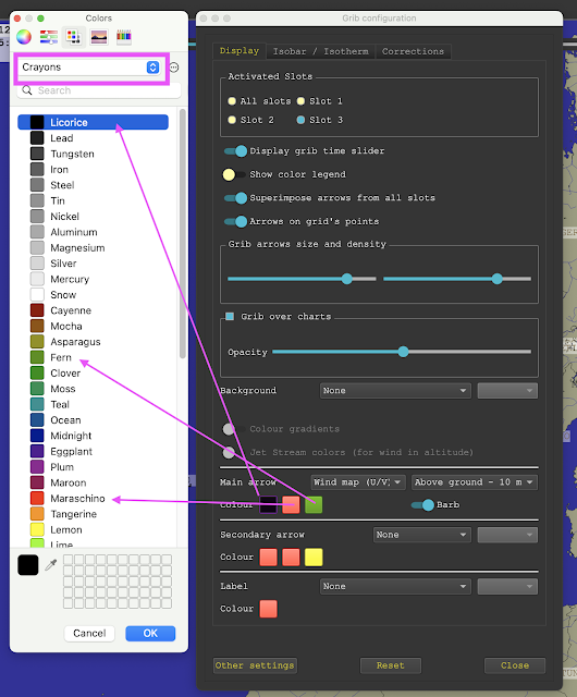

The bottom slider controls the thickness. Midway is good.

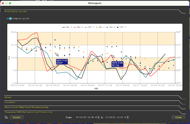
This is the forecasts for Point AA. A cursor over the point brings up the values, faked here in that only one at a time can show. We see mixed agreement at this point over time.

This is the forecasts for Point BB, which is pretty good agreement for the first two days.
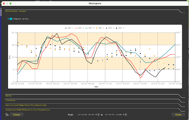
This is the forecasts for Point CC. We see the models agree and disagree over different areas and times, but this is just a demo of how this works. Generally we would be focused on a more localized area.

Slot 1, black, is the GFS.

Slot 2, red, is the ECMWF.
Slot 3, green, is the COAMPS. This is a US Navy regional model, which accounts for why it does not cover the full extent of the other two, which are global models. The transient weak Low at point BB does not last long.
No comments:
Post a Comment