Saturday, November 12, 2022

Adding an image to a PDF

The procedures presented here apply to any application of adding an image to a PDF, but we are focused on a specific marine navigation application. 

The NOAA Custom Charts (NCC) app sometimes has difficulty placing compass roses in best locations.  in which case you can just shut off the compass rose option when creating the NCC and then make one with the free app below. That will generate a NOAA-style compass rose as a PNG file with a transparent background that you can then paste onto the PDF NCC where you choose, and resize as desired.  See Instructions on adding an image to a PDF.


Preliminary Notes

The NCC PDF includes the chart itself and several pages of chart notes. You can print all pages of the NCC on a regular printer paper and that gives you a compressed view of the chart, along with the chart notes. At this stage we can then concentrate just on page 1 of the NCC which is the chart itself.


To remove all pages of the NCC except the chart (on page 1):

1) Open the chart in Google Chrome

2) Choose Print, top right icon

3) Under Destination choose Save as PDF 

4) Under which pages choose Custom and enter 1 in the field below it

5) Print, with the option to rename.


Owners of Adobe Acrobat Pro, with Mac or PC. This is the easiest solution.  


1) Open the PDF in Acrobat

2) Choose Tools tab and then Edit PDF

3) Choose Add Image, navigate to the rose PNG saved, press Open.

4) Resize with a corner control; drag to desired location

5) Click Close top right of the display.  Done


Mac computers use Preview App. (Easy… but involves an unusual trick!)


1) Open the PDF in one Preview window and open the rose PNG in another Preview window.Do this by right clicking the files in the Finder and choosing Open with Preview.


2) In the rose window, click the screen to activate it, then do 

cmd+A to select all, then 

cmd+C to copy all, then 

cmd+V to paste what you copied right back on top of the image, 

then click the center of the image to activate it then

cmd+C to copy

3) go to the NCC window and click to activate it, then do cmd+V to paste the image onto the PDF

4) size as desired and more to desired position, then cmd+S to save and you are done.


PC computers install free graphics program called Inkscape and use it.


1) Open Inkscape, then menu File/Open and open the NCC PDF

2) accept all defaults they offer and choose OK

3) Position the window so you can see the full PDF

4) Do ctrl+A to select All

5) Right click image and choose Lock selected objects

6) Menu Layer / Layers to open the layers window on the right. 

7) Lock the top layer shown which is your NCC chart by clicking lock icon

8) Click + to add a layer; call it “compass rose”; Position “above current”, be sure it stays highlighted


9) Menu File/Open and open the rose PNG

10) Click the rose to activate it, do ctrl+A to select all, then ctrl+C to copy all.


11) Right click the screen and paste the rose

12) Position and size it as desired, then menu Save as, choose PDF format with name of choice, and done.


Wednesday, November 2, 2022

Slow Water Rule

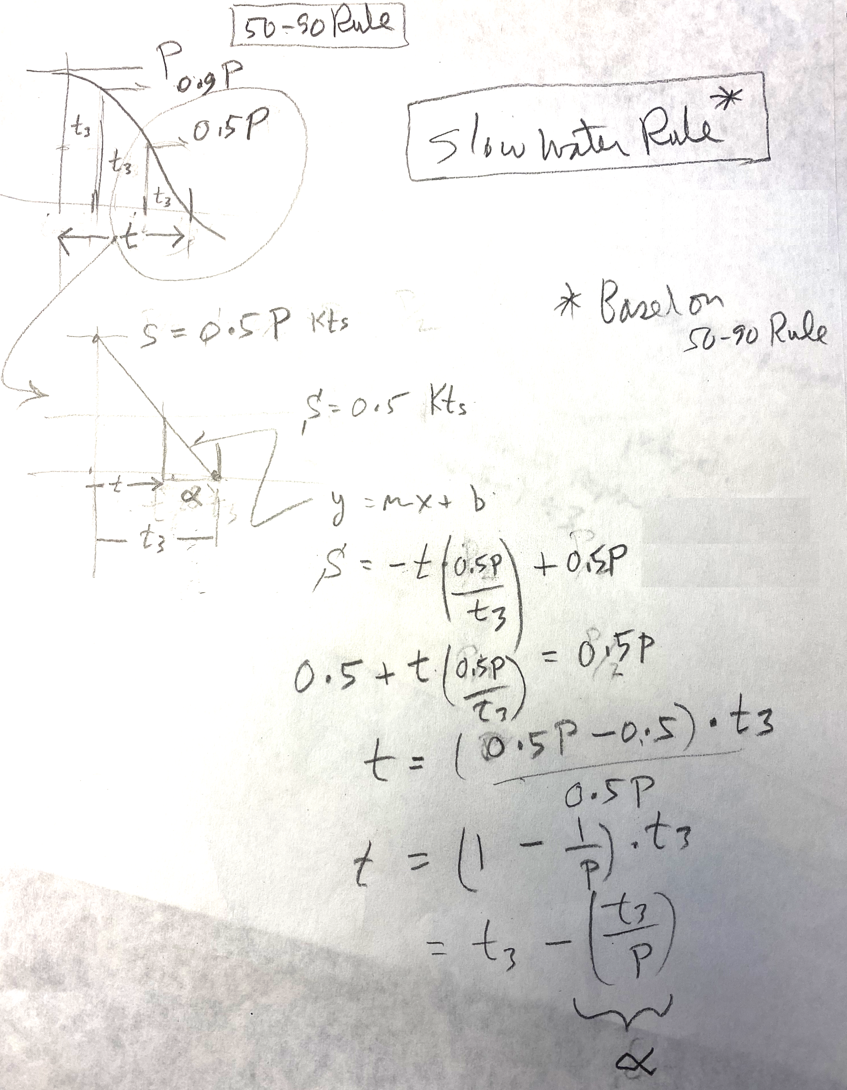
Our 50-90 Rule for estimating tidal current speeds between tabulated peak currents and slacks has been adopted by the US Power Squadrons, who have developed a form for its use. What is less well known is our Slow Water Rule for estimating the time the tidal current will remain below 0.5 kts at each slack time. This rule is actually based on the 50-90 Rule as is shown below.

The Slow Water Rule states that the current stays less than 0.5 kts on either side of slack for a time (in minutes) equal to 60 minutes divided by the peak current speed in knots. This period is usually different on each side of the slack for mixed semidiurnal tides. That very simple form assumes the period from peak to slack is equal to the global semidiurnal average of 3 hr, but there are many cases where this varies from just 2 to over 5. Thus to make the Rule more accurate, replace the 60 min with one third of the actual time interval between peak and slack.


A main purpose of this post is to document how this Slow Water Rule comes from the 50-90 Rule, and that is shown in the hand drawn image below.


In this sketch, t3 is one third of the slack to peak times.  Alpha is the slow water estimate we propose.

Granted, we are looking backwards with these efforts to do navigation in the head, on the wing. Traditional paper charts are being completely replaced with electronic charts (ENC) and with that more and more mariners will be using some form of electronic chart system (ECS) for their navigation...more commonly called just a "navigation app" or "echart app." Popular free ones are OpenCPN and qtVlm, both of which include excellent tide and currents functions that display and plot the tides or currents—which pretty much answer any question we have about this crucial data. Commercial nav programs also, of course, include excellent tide and current presentations that answer tide and current questions with a couple mouse clicks.

In short, traditional methods in all aspects of navigation are likely to be set aside as we move more into more electronic charting. We complained about this when GPS came on the scene, and there will likely be more complaining as the charts get transformed from traditional preprinted fixed editions to the new user-designed and user-printed NOAA Custom Charts (NCC).  It will take a while for the NCC to settle in, but I am confident that in the end they will be in fact superior to the traditional charts they are replacing. 


Tuesday, October 18, 2022

Viewing HRRR Wind Forecasts in OpenCPN

Errata added May 18, 2023. 

This article was intended to point out a limitation in the HRRR data provided by Saildocs and a couple other sources in that the wind directions on the two US coasts could be off by some degrees, which we could easily account for. We do not know exactly when this was corrected but looking today we see that this correction has been made, so the HRRR data  from Saildocs is now identical to what we would get from a direct NOAA download. This is good news for many sailors as Saildocs remains the most convenient free source of weather data and we all remain very grateful to them.

__________________

HRRR (high resolution rapid refresh) is one of the premier regional wind models from NOAA. The native data are distributed through NOMADS in a grib2 format that uses a Lambert projection, which is very similar to a great circle projection. OpenCPN at present cannot read and display that format, as is the case with many echart programs and grib viewers. With that limitation in mind, Saildocs has done a service for mariners by converting the Lambert projection into a rectangular Lat-Lon projection that can be read in OpenCPN and other grib viewers.

The attached video shows the process of obtaining the HRRR grib from Saildocs, which is straight-forward, with a couple precautions to guard against large files. We propose a hybrid solution that lets OpenCPN create the email request that we then tweak a bit before sending to Saildocs.

There are two formats for the HRRR data. The standard model forecasts are computed every hour and there is a forecast made for each hour going forward, out to 18 hr. There is just over a 1.5-hr latency, meaning that a forecast computed at say 15z (z=UTC) will have the first of the 18 hourly forecasts valid at 15z, but we will not be able to download this forecast until about 1635z.

The second format is same as above, but at the synoptic times of 00, 06, 12, and 18z the forecast extends out to 48 hr. Saildocs calls the standard version HRRR and the extended version is HRRRX. The latency for this one is just over 2h (0205). Thus the 48h forecast ran at 12z will be available at about 1405.

The main point I want to stress here, however, is the native HRRR CONUS (continental US) forecasts obtained from NOMADS present the wind direction relative to the orientation of the grid, which in the Lambert projection does not line up with the North-South meridians, and this correction is not accounted for in the HRRR data from Saildocs. An overview of the corrections is shown below.

The HRRR CONUS coverage map is from luckgrib.com/models. I have overlaid the approximate orientations of the grids.

Saildocs HRRR wind directions in the East CONUS are too small and we must add these corrections depending on location.  In Cape Cod, for example, the correction is about +15º, so when you read a wind direction of 100, the actual HRRR forecasted wind is 115.  In the coastal waters of the West CONUS, we subtract these values to get the actual HRRR wind directions. In San Francisco Bay, for example, the correction is about -15º so an HRRR wind from Saildocs of 100, would  mean the intended HRRR forecast is for 085.

These shifts of roughy ± 15º along the coasts are not really so significant for a static forecast, keeping in mind that the the model data themselves and all the buoys we read the wind from are only accurate to ± 10º or so.  But this offset is something to be aware of when doing optimum weather routing computations as this shift can have a significant effect on those results.

The nominal average of about 14º to 16º right along the coast is correct for the actual grid orientation but the projection conversion process introduces some spread to this. The values pictured above should be considered ±3º or so.

We focus on OpenCPN in the video demo below, but this same correction would be called for when viewing the Saildocs HRRR gribs in any viewer. 

I should stress that the programs Expedition and LuckGrib are two that provide their own access to the native HRRR data and their presentations are correct as displayed.  


Video demo of the topics above.


Friday, October 14, 2022

Compare Wind Forecasts in qtVlm

For routing analysis and computations we have several global models we can choose from, as well as several regional models. An important step is choosing what might be the best forecast. Elsewhere we have an in-depth article and video on Evaluating a Weather Forecast, but our first step here is just comparing what the different models forecast.

We will use qtVlm for this, which is the free program we use in our Marine Weather and Electronic Chart Navigation courses. Similar analysis can be done with Expedition or with LuckGrib, and other programs as well. 

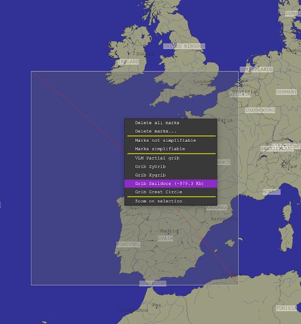
Step 1. Download the data. We use three global models available from Saildocs, accessible from within qtVlm, but in practice you may choose other products or sources.


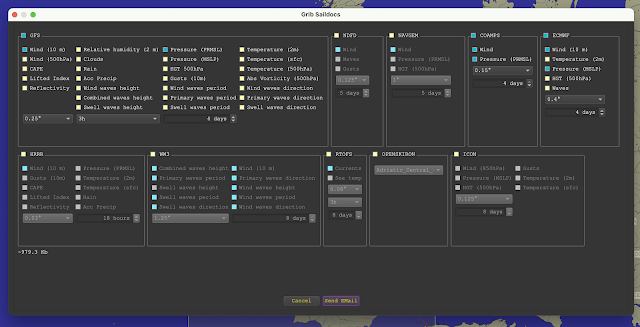
Then select the models (blue means on, yellow means off, for all of qtVlm):


Here we choose wind and pressure from GFS, COAMPS, and ECMWF. We are after wind comparisons, but the pressure can help us understand what is taking place.   Pressing send email creates the request we send to saildocs and they send back by return mail the 3 model forecasts in grib format. We asked for the best resolution that each model offers and restrict the comparison to the time interval of the shortest one, namely COAMPS at 4 days. In each case we ask for a forecast every 3 hr.

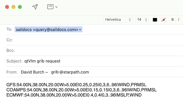
The generated email then looks like this shown below. We could create it manually as we explain in  Modern Marine Weather, but the auto generate function is a convenient tool.

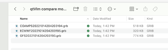
We get back three emails with the grib files as attachments, which we then drag into a folder to be used by qtVlm, which looks like this:


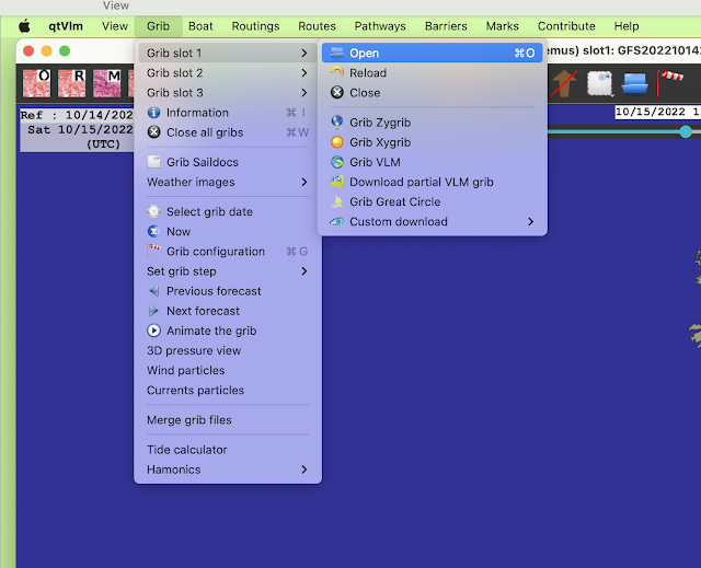
Now we load each of these into qtVlm, starting with slot 1. The order is up to you.

At this stage you navigate to the file in the folder above and say OK. Then do the same with slot 2 and slot 3 for the other two forecasts.

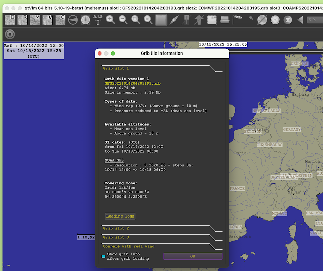
Once all are loaded, they will be listed in the title bar and you can use menu Grib/Grib Information to inspect the contents of each if desired. The wind barbs themselves might not being showing if we do not yet have them turned on.


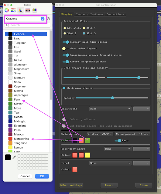
Next we want to use menu Grib/Grib configuration (windsock toolbar) to set up the wind display to enhance the comparison.  Use these settings:


The colors have to be done one at a time. The three arrow colors are slots 1, 2, and 3. Set one; close it; set the next. The logic of these color choices will be clear shortly.... or maybe not!

Next set the isobar display using the isobar/isotherm tab.


The bottom slider controls the thickness. Midway is good.

Now we can turn on the wind and see the first comparison:


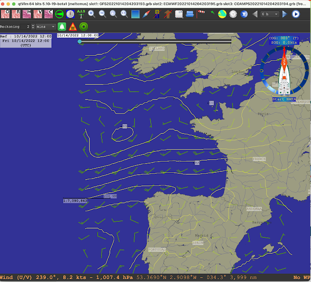
Black, red, and green are 1, 2, and 3, which can  be checked in the title bar.  We see good agreement in some places and poor agreement in others.  This is the first forecast (effectively a surface analysis) which we see from the slider being far left. Change times with the slider or use the clock icon to digitally set to a specific time.  This way you can scan through to see how the agreement stands, looking at a large area, or zoom in to look at a more local area.

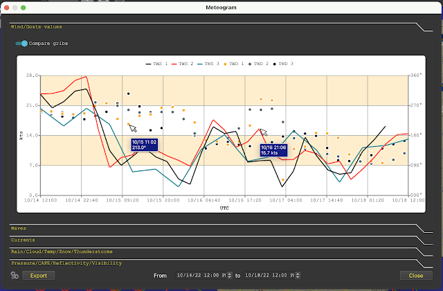
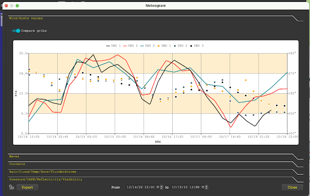
For time comparisons and a more digital comparison, right click where you want to see a meteogram, and then choose "Compare models," as shown below. 

The meteograms always start at the location of the on screen display, indicated by the grib time or slider location.

Also we see now the intended motivation of the color selections. These meteograms have fixed colors so we have just forced wind barb colors, which we can change, to match the graph colors that we cannot change. Else we have 6 colors to sort out, or worse, the same colors meaning different things.


This is the forecasts for Point AA. A cursor over the point brings up the values, faked here in that only one at a time can show.  We see mixed agreement at this point over time.


This is the forecasts for Point BB, which is pretty good agreement for the first two days.


This is the forecasts for Point CC. We see the models agree and disagree over different areas and times, but this is just a demo of how this works. Generally we would be focused on a more localized area.

Referring back to the wind barbs view above we see some areas agreeing and others not. This would generally lead us to look at the isobars. But there are some nuances to getting the most out of this, in that for now we cannot directly compare isobars from different models. We have to look at each individually, and we will likely find one model more useful than others. Here are the three models with their isobars for the surface analyses at 12z (first forecast).


Slot 1, black, is the GFS.


Slot 2, red, is the ECMWF.


Slot 3, green, is the COAMPS. This is a US Navy regional model, which accounts for why it does not cover the full extent of the other two, which are global models.  The transient weak Low at point BB does not last long.

In you own boat at sea or along the coast, you will likely have an have an accurate barometer in your pocket, so you have compelling information about which of these models might be closer to the truth.

qtVlm also offers a very convenient way to download and plot all the buoy and ship reports around you which is more data to add to your own wind and pressure measurements to help pin down the best forecast.

Below is a video illustration (11:19) of the above: