Friday, October 29, 2021

ENC Object: Tidal Stream, Flood and Ebb (TS_FEB)

 We have two ways to learn about tidal currents in a typical navigation program, such as qtVlm and OpenCPN that we use in our online courses, and numerous other commercial versions. 

First, we have the overlay of current and tide predictions that the navigation program itself computes for us, based on the harmonic constants we have loaded.  This source of tide and current data is our main workhorse for navigation, but it has nothing at all to do with the ENC charts themselves. It is a program function, unique to each program in the details of how it presents the results. These current predictions work perfectly well looking at ENC or at an RNC, but we can also shut off the charts completely and just use the  base map to obtain currents over the areas covered by the harmonics loaded.

Completely independent of those forecasts are the tidal current summaries that are included in the ENC and indeed in many cases on the related RNC as well, and it is these ENC current data that are the subject at hand.

The ENC object is called Tidal stream, flood and ebb (TS_FEB), the symbol is a current arrow, usually in pairs, one showing the flood direction, the other showing the ebb direction. On the RNC these are labeled with an F and and E, but not on the ENC—but  it is easy to tell because: "the Flood has the Feathers."  You can cursor pick these objects, but we do not learn more than shown, namely the average direction of the flood and ebb along with the average maximum speeds.


A cursor pick gives the report below.


There are a couple nuances to the use of this parameter. One is the S-57 standard for this current velocity is the average of the maximum spring currents, whereas the NOAA standard is to use the full average of all maximum currents. Thus we must keep in mind when reading these averages that during a full moon or new moon we can expect the peak max flow to be about 20% larger than we read on this ENC object. In principle this is not the case when viewing this object on the charts of other nations—with Canada being an exception for adjacent waters, because of our historic sharing of this data.

The second, more important point to keep in mind is these predictions on US and adjacent Canadian charts are at present not the latest values available—so the distinction between full average and spring averages is not really significant. It appears there is some internal NOAA communications catch up called for. One division makes the charts and codes the data we read here, but it is another division that makes the tide and current predictions that the chart makers depend upon. 

All of the related NOAA divisions are undergoing major changes these days—not to mention that they are also mostly working from home—so it is not too much a surprise that we experience a transition here, and indeed this is not a serious issue. But somethings can and likely will change soon with the ENC. The blue link in the ENC cursor pick report shown above, for example, brings up the text message shown, which refers to an official NOAA book that no longer exists. The last issue of that book was 2020. The new reference should be something like "For exact predictions see www.tidesandcurrents.noaa.gov" — or for completeness, there may in fact be 2021 books with a similar title that are no longer approved by NOAA that include the old 2020 corrections.

One of the reasons given by NOAA for discontinuing the annual printed current tables is the increasing use of digital sources of these predictions based on the harmonic constants that can be used to compute the predictions. And, indeed, NOAA makes these constants available to the public. The navigation program we use, qtVlm, is just one example of how convenient it is to get current data at any time, now or into the future. We also illustrate how you can confirm that the harmonics you have are valid.

Historically, the TS_FEB objects were placed on the RNC and ENC at each of the locations of the reference stations (now called harmonic stations)  and  subordinate stations. But over the years, NOAA has discontinued some of these stations, but some TS_FEB objects are still there, even through there are are no longer any official predictions for those locations.

It seems that the US ENC chart makers are aware of these issues and the role of the TS_FEB object is likely in a state of flux. For example, if we look at all US charts in the Eastern Strait of Juan de Fuca that are north of the ENC cell boundary at 48ยบ 20' N, there were at one time about 100 of these objects. And indeed if you look at the latest Canadian charts that cover this region they are all still there, using the original US tidal data. But the US has removed all of these objects from the ENC in that region, in part, I suspect, because the data are no longer the latest values.

To be more specific, NOAA has current predictions at multiple depths, and we cannot just say "take the one closest to the surface," because at some stations there are multiple forecasts within 30 ft of the surface. In short, we have to look now to see what might be best. 

Also there is the much more practical point that many of the currents shown at the TS_FEB locations are not purely reversing currents as might be implied by just two arrows. Newer NOAA data shows that many of the stations are more rotary than thought some years ago. A pure reversing current has just two directions, with speed diminishing to zero as it changes from one to the other, whereas as a pure rotary current does not change speed, but just rotates from flood to ebb direction. Real currents are a  combination of both, showing an elliptical pattern in the plot of the current vector—typically in between pure rotary (ellipse pulled out into a circle) or pure reversing (ellipse squashed flat into a line). 

From our text Inland and Coastal Navigation. As a rule, coastal currents are more rotary than inland, but there are notable exceptions.

In short, these TS_FEB data in the region of our training charts (Eastern Strait of Juan de Fuca) can serve as a quick guide to current flow at peak strength, but the values shown may not reflect the latest knowledge. A couple examples are below.

Notes:

1. From cursor pick of the ENC symbol

2. Data from the last edition of these books. These data will become increasingly less dependable as NOAA updates their stations with new measurements. 

3. We get the average directions from a stations daily report; and then we figure the average speeds by downloading the full year of data and averaging the year's ebb and flood speeds in a spreadsheet. (We do not know where the average speeds are given, now that Table 2 is no longer supported.)

4. This is one of the objects removed from US charts, but still appearing on Canadian charts.

5. This is a random check of one station on the East Coast, using the Atlantic 2020 Table 2 .


Monday, October 11, 2021

Bruce Stark, Navigation Historian, Dies at 95

Bruce Stark’s classic treatment of the lunar distance method in 1995 sparked renewed interest in celestial navigation worldwide, quite beyond that one specialized technique. His work will be remembered as a key step in the history of marine navigation. 


He died peacefully in a Eugene OR area hospital following carotid artery surgery.  His wife Janice had close contact with him during this time, which was an unusual blessing in these COVID days that often prevent patient visits.

Bruce Stark became interested in celestial navigation as a sailor and outdoorsman in the late 70s, when he began the painstaking journey to becoming a leading expert on the navigation of Lewis and Clark, and especially the esoteric sub topic of celestial navigation devoted to finding longitude from sextant measurements of the distance between the moon and other celestial bodies, called the Lunar Distance Method. His innovative book on a new solution to this problem took him 20 years to perfect, but it received instant praise by experts in several countries.


Navigators had been following his reports on the development of his method along with extended notes on the navigation of Lewis and Clark in the Navigation Foundation Newsletters (NN), where they are still available to the public at www.navigationfoundation.com. Admiral Thomas Davies, founder of the organization, was the first to note the value of the work followed by in-depth reviews from several international experts.

Robert Eno from Iqaluit, Canada (NN, Issue 65, Fall 1999, page 7) in an extensive study of the method included these observations:  

"Stark has taken all of the tedious and complex calculations formerly required for lunars and reduced the whole process to a simple exercise of addition and subtraction." 

"Had he been born 200 years ago, he might have been remembered with the same veneration as Raper and Chauvenet whose names are now synonymous with lunars. "

"Now that Stark has made the process so simple, there is no excuse for the serious navigator not to try his hand at lunars."


The main point being made is, the Stark Tables provide an all manual solution. We have many ways to solve lunars these days with computer computations, but his method is all paper, no batteries required.


Later, Professor Jan Kalivoda from Charles University in Prague did another extensive review (NN, Issue 92, Summer 2006, page 12) that included these notes:

"I was astonished by their ingenuity. They don't repeat old solutions mechanically, but are significantly better than renowned works of the past, although they don't misuse the modern technical possibilities and go the fully traditional way of tabular and paper solution. It had to be an intellectual adventure to compose them and it is a delight to study them. "

"After Bruce Stark had published his tables, every sailing navigator (fondling the GPS in his pocket) can revert to the sea history in his practice very easily, if he chooses. He can be sure that with these Tables, the history of Lunar Distances is consummated now and the long line of rigorous methods for clearing them ends successfully—and for the first time, after all of these years."

The reason the Stark Tables kindled such renewed interest in cel nav and sextant work—which is ongoing—is the fact that the special sextant measurements required are difficult, taking exceptional sextant skill. But at the time of his book, there were not quick computer solutions to the lunar analysis, so the analysis of the sights was also very difficult. With the advent of his book, navigators had a way to hone their skills in sextant sights and then a way to see if they got it right. And on top of that, there is no heaving deck and ocean horizon needed for this practice. You can do this from a chair in your backyard.

We frankly do not  have much call for this method in practical navigation, but learning it makes you a better navigator, much as taking a few lessons on aerobatics makes you a better private pilot. On the other hand, a Long Term Nautical Almanac, including a set of Pre-computed Lunar Distances, along with the Stark Tables constitutes a Doomsday Navigation Kit, with which you can find your accurate location on earth without any semblance of technology or even civilization at all, period. There is not really any other way to do that.

Bruce had the devotion to detail needed for his work and a very reserved personality. It was Starpath Publications  who boldly added "Stark Tables" to his original title much later when we joined in to help with its publication and distribution. 

So it might be understood how pleased we were when he agreed to present a seminar here at Starpath on lunar distance and related Lewis and Clark navigation. This was in April of 2001, organized in conjunction with John Lewis, Puget Sound Maritime Historical Society, along with a representative of the National Park Service.  Bruce was nervous about an event like this that he had not done before, but it all went very well, and we became friends ever since, ultimately leading to our publication of his book. He went on to participate in other National Park Service events about Lewis and Clark. 

We were doubly fortunate and extremely grateful for his later donation of much of his navigation research library to Starpath, which is indexed online at www.starpath.com/library. We have made remote use of the documents open to the public and a several researchers have taken advantage of that. 

Bruce was active in navigational matters up to several years ago. One of his later interests was readdressing how much cel nav computations could be carried out with a simple slide rule, which he and I both carried around on our belts in early college days.

What always struck me was our shared strong opinion that dead reckoning remains the basis of good navigation. In many posts he would note that quality dead reckoning was as important as cel nav itself, and he ask for and motivated others to write more about it in the Newsletter, which was just one more important contribution to navigation practice.


Tuesday, September 21, 2021

Role of SCAMIN on ENC

Electronic navigational charts (ENC) are not at all new to navigation. They have been in use by commercial vessels for over 20 years, but they have not really caught on much with recreational mariners. This is in part because they look different from paper charts, but also largely because their presentation on the screen and how users interact with them is so different from the use of raster navigational charts (RNC), which are static images of the paper charts.

One of the things that is notably different with ENC is when you zoom out on the chart, the chart symbols and text labels do not change size. They can do this because ENC are all vector products and they just redraw everything at each new scale, and this keeps the symbols and text  in view

That is, unless you happen to be zooming out on a region that has a lot of symbols. Zoomed in they are far apart on the screen but zoomed out they pile up to the point of becoming totally unreadable.


Above is a sample of a cluttered screen with SCAMIN not engaged. In ENC terminology, this is Display mode All, which means show all objects. This chart is actually over-zoomed in on a very small scale chart.... all new terms we need to look into here. 

There are several ways to clean this up.  


We don't want to go this far, leaving just water and rocks, but there are many levels in between, which we can set up depending on our navigation needs. This is Display mode Base, which is the minimum objects possible.

The ENC and their presentation rules address the issue of cluttered displays by assigning to each charted object an attribute called "Scale minimum," which has an abbreviation SCAMIN.  But to pursue that idea, we need more terminology.

All paper charts have a well-known properly called its chart scale. A scale of 1:40,000, for example, means that 1 inch on the paper chart is equivalent to 40,000 inches (0.55 nmi) on the ground or water being represented. On a 1:80,000 chart, 1 inch would be 80,000 inches, about 1 nmi per inch, and so on. 

That is a plain enough concept, but we can make this more complicated! 

Chart scales are described as large scale or small scale based on thinking of the scale as a fraction: 1/20,000 is a larger number than 1/40,000 which in turn is larger than 1/80,000.  Thus we call 1:10,000 or 1:20,000 large scale charts, whereas 1:80,000 or 1:150,000 are small scale charts. Studying traditional navigation we slowly become used to that, and we could arrange our stack of paper charts in order of increasing or decreasing chart scale as we might choose. 

But any one paper chart only has one scale, and it never changes.  When we view a chart in a computer, where we can zoom in and out on the display, we are changing its scale each time we change the zoom.  So we need new terms.

A specific ENC is almost always based on a specific paper chart (RNC), or predominately on one, which has a unique scale, and that original scale used to make the ENC is called its compilation scale.  We can ask an ENC for its chart properties, and it will report back a scale, which is its compilation scale. The ENC US5WA16M, for example, is based on paper chart 18471 which has a scale of 1:40,000 so the ENC has a compilation scale of 1:40,000.  (This relationship between paper chart scales and ENC scales will eventually change with NOAA's ongoing rescheming program, but that is the way most ENC are for now.)

Viewing this ENC on a computer screen, we can zoom in and out, ending up with various scales. The scale we happen to be looking at is called the display scale.  Nav programs let us view this scale on the screen as we zoom in and out. The display scale can be larger or smaller than the compilation scale. In principle, the scale shown has the same meaning we are used to with paper charts. Namely viewing a chart at a display scale of 1:44,882 should mean that 1 inch on the screen is 44,882 inches on the charted ground. Some programs are fairly good at this, others less so. It is an easy thing to check comparing with the RNC of the same area.

In principle, any one ENC is intended to be viewed at the compilation scale for crucial navigation, with the obvious knowledge that the user is going to zoom in and out to meet their needs. Keeping in mind that the scale names "go backwards" in a sense, the table below reminds us what zooming means.


When we zoom in we are going to larger scales, and land in view will get larger as we do so, but the actual scale values will be getting smaller. 

With this background we can now look at a unique property of all ENC objects. They each have an attribute called Scale minimum abbreviated SCAMIN. SCAMIN is the minimum display scale that will show a specific object on a specific chart.  Below are a few samples of how SCAMIN values can change with chart scale.


Charts in the top two groups have overlapping coverage of at least one of the objects listed; the bottom group are adjacent and overlapping charts.

If you are viewing the chart at a display scale equal to the compilation scale, and you zoom out from there in steps (going to larger scale numbers), then at some point the object you are looking at will disappear. This happens when your display scale equals the SCAMIN value. 

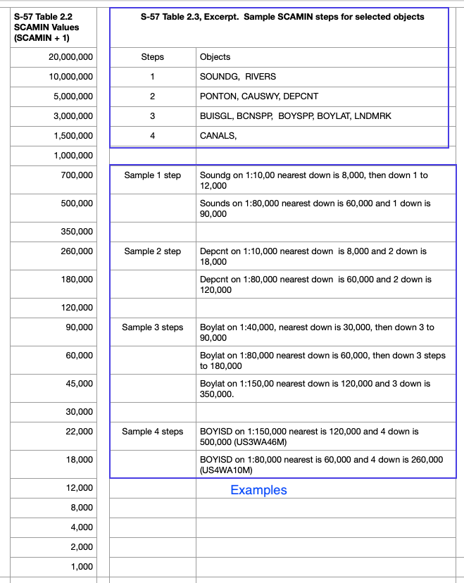
The diagram shows SCAMIN + 1, because the SCAMIN values are encoded in the ENC as 1 less than a common chart scale. Thus we do not see SCAMIN = 1:12,000; we would see SCAMIN = 1:11,999. This is presumably done to prevent rounding errors at the transitions. We have just undone this here for clarity.

Thus SCAMIN has a couple effects on our practical navigation.  Zooming out, it keeps the charts from getting too cluttered by removing objects we might not be looking for on smaller scales, but in doing so, it might well be hiding an object we are looking for. Thus we have to be mindful of SCAMIN values and how they work. It is called "scale minimum," which means the smallest scale it shows on, which we have to recall means the largest "scale number" it will show on.

Plus there are several subtitles we have to be on the lookout for. A lighthouse might on one chart be called a Landmark (LNDMRK) and on another chart be called a Single building (BUISGL). Recall that on ENC, we do not have lighthouses, we have LIGHTS and we have objects (LNDMRK or BUISGL) whose FUNCTN attribute is Light support. On a 1:10,000 chart, the former is in view all the way to 1:22,000, where things are half the size they are compilation scale, but the latter goes away at 1:12,000, where these same things have only diminished in size by 10 or 20%. Depending on your nav program and how you have it set up, starting from the compilation scale, the former is in view for 10 steps of zoom, whereas the latter goes away in one step.

Another issue comes up when two adjacent or overlapping charts have notably different SCAMIN for the same object. Then you can see an object bounce in and out of view as you change charts.

In extreme cases, if you ignore all the many safety features built into an ENC and a good nav program or ECDIS, then you could in principle view a chart at the compilation scale and then zoom out enough to hide a dangerous sounding and then navigating on that scale you hit it. There are articles online about ships doing that, but you have to do so many things wrong to get to that point that this is not a serious concern. The use of ENC safety contours and alarm-triggering COG predictors will prevent this, not to mention going over a planned route carefully once set up, which is standard procedure.
___________________

So with SCAMIN we see that zooming out from the compilation scale by something like a factor of two or so (i.e., going from 1:40,000 to 1:80,000) can remove objects from view. This is sometimes called "under zooming." 

Going the other direction, zooming in from the compilation scale by a factor of two or more (i.e., going from 1:40,000 to 1:20,000) is called "over zooming," and this has its consequences as well, although it is not uncommon to do so with caution in routine navigation. The primary consequence is we risk displaying chart details at a level that is beyond their actual accuracy. Because of that, nav programs have various ways to alert mariners to an over zoomed chart, usually with a prominent announcement on the screen.

Type approved ECDIS cover an over-zoomed chart with a grid of parallel lines, but this is considered more than needed by most unofficial electronic charting systems (ECS). We have notes elsewhere on over zooming as well as how we tell what the base accuracy of the charted objects is to begin with.

___________________

For completeness, we add here the complex way that the IHO recommends the choice of SCAMIN based on compilation scale and specific object. They publish a Table 2.2 that lists the only values that a SCAMIN can be.  Then there is a Table 2.3 that lists all objects along with the steps down in scale within that table to find the right SCAMIN to use. If the compilation scale of the chart is not on Table 2.2, then start with the one that is just below it.

Along with that we have a few examples of how this works, keeping in mind that many objects also have more rules that govern the recommended SCAMIN values. I selected examples without extra rules.

Recall that going down to a smaller scale means to a larger number, and "3 steps down" in scale on this table means going up the list! We see that all the examples looked at follow the prescribed rules.


                                                          SCAMIN and Rescheming

Rescheming is NOAA speak for improving the ENC format, standardizing chart shapes and sizes, as well as contours and scales.  We know from above that SCAMIN values depend on chart scale, so when the scale changes, so does the SCAMIN values. Dividing up a 1:80,000 region into a series of 1:20,000 is a common transition, which would make buoys (at 3 steps in the table go from SCAMIN of 179,999 to 44,999, which is just what we see in these samples from Galveston Bay, where both charts are still available.  

Below we see these daymark beacons with their new SCAMIN on the reschemed charts. In the bottom chart, we see the new (1:20,000) reschemed charts outlined in red, because the they are totally covered by the legacy (1:80,000) chart.  The blue lines mark boundaries of adjacent, same-scale charts.


Monday, September 20, 2021

Online ENC Object Catalogs

Everything shown on an electronic navigational chart (ENC) is called an object, and each object has a set of attributes that describe its details. The concept is discussed in this article about ENC terminology.

Our textbook Introduction to Electronic Chart Navigation has a list of all ENC objects and all attributes, but it does not include all the possible values of each of the attributes for all of the objects. This would be many pages of fine print.  We have an example online that shows the complexity: Landmarks in ENC. Looking at that we cannot help but say, "We need an app for that, " and indeed there are online resources that do just that. They are called, reasonably enough, ENC Object Catalogs.

Prior to 2023, there were two such catalogs on line. One popular one from Russia, which was easy to remember was www.S-57.com. I will show below what it offers, but it was removed from the internet three years ago.  We have recovered a historic link to the site, and we can at least for now (Jan, 2026) still use it.  See:

 www.tinyurl.com/S-57catalog

Below is a description of what we can get from that archived resource, which has some advantages over the remaining active site from teledynecaris.com, which is discussed below. The fact that one is old and one is live does not matter because the standards and definitions of the objects and attributes have not changed and likely will not for a couple years until the ENC system is replaced with the new standard, S-100.

The name S-57 comes from the IHO standard for ENC content, called IHO Transfer Standard For Digital Hydrographic Data, Edition 3.1, Special Publication No. 57, usually referred to as simply "S-57."  This is a complex document that refers to what should be in the ENC—it does not, however, specify how the information should be displayed on our screens. The rules for the display are in another complex document called S-52.

The landing page of s-57.com (still available from the tinyurl link above) looks like this:


You can click the image for a larger view, or to get even larger view, open image in another tab and then enlarge. This applies to all Blog post images.

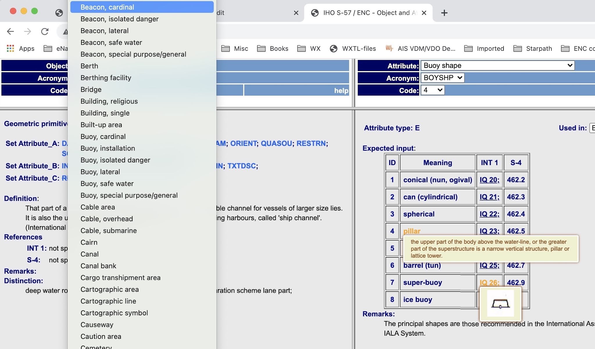
The objects are on the left and the attributes on the right. Click one of the blue Attributes on the left to load it into the right side where you see the various values that attribute can have.

There is a Help file provided, but besides giving the references does not add much. We learn that red warnings that say "Deleted objects, do not use" means just that. They list here 501 objects, of which some 400 are active. Not clear why they keep the invalid ones, but I think this site has not been maintained for many years.

Find the object you want, or look over what is there, with the object dropdown arrow. You can type the first letter of your object, but it will not search beyond that one. 

The objects's abbreviation is also listed, but these are not known to those new to ENC. The IHO and IMO discourages the use of these abbreviations, but they can in fact be convenient in some cases. The IHO calls these "acronyms," but this stretches the common English definition of the term. 


Once you  load the attribute of interest on the right, you can see the optional values and also do a mouse over the meaning column to get its official definition. 

Likewise, in the INT1 column, any item that is underlined is a live link to pop up the international paper chart symbol.  The INT 1 symbol is the one that appears in the first column of the Chart No. 1 booklet of chart symbols.


Section of a page from Chart No. 1.  We have an ECDIS version of this in our textbook.

For each object we see three types of attributes listed: A, B, and C


Set Attribute_A: "attributes in this subset define the individual characteristics of an object."

These are the main properties of the object. In this case of a lateral buoy: Buoy shape, Category of the buoy, Color, Color pattern, and so on. Click each one to see on the right panel what it means and what its value is. In this catalog, just ignore any item that has a line through it. Type A attributes do not change on various charts and scales.

Key here is the indicator (!) which means this is a mandatory attribute. (!?) means it is a conditionally mandatory, i.e., if more than one color is given in the Color attribute, then the Color pattern attribute must be given.

The Definition, References, Remarks, and Distinctions shown here are those of the object itself.

Set Attribute_B: "attributes in this subset provide information relevant to the use of the data, e.g. for presentation or for an information system."

This set has the same components for all objects, but their values can change from one object to the next, and they can change for the same object viewed on different charts—or they could be the same for all objects on the chart. INFORM (Information) and TXTDSC (Textual description) are used to present information that is presented in the paper chart notes, or new information about the chart itself. These two attributes should not include any information that is in other attributes. The main distinction between INFORM and TXTDSC is that the former contains only text, whereas the latter provides links to text files that are part of the ENC itself. Open the ENC folder on your computer to see these files. These attributes are crucial to chart work, but easy to use and interpret. A leading N in the attribute name means it is the same information expressed in the national language of the chart producer. A French chart will have INFORM in English and NINFOM in French.


The more subtle and important type-B attribute is SCAMIN,  the minimum display scale that an object will appear on. We have a separate note on Role of SCAMIN on ENC.

Set Attribute_C: "attributes in this subset provide administrative information about the object and the data describing it."

*  *  *

Most of the above discussion also applies to the still active online ENC Object Catalog provided by Teledyne CARIS, a long standing Canadian-American company specializing in GIS and related technologies.


...or  google "caris enc catalog."

This one is now  faster to get to, and to use, providing you know the abbreviations for the objects and attributes of interest, which you can get quickly from an appendix to our textbook. To the extent things might change, unlikely as noted, we can be more confident that this one is up to date. It also has all the attribute definitions in a single file that might be more convenient for some  applications. 

With the above discussion of how these catalogs work, the use of the Caris version will likely be clear from the presentation, and the better one to bookmark for quick questions.